Patch: an app for small business owners
UX Design
UX Design
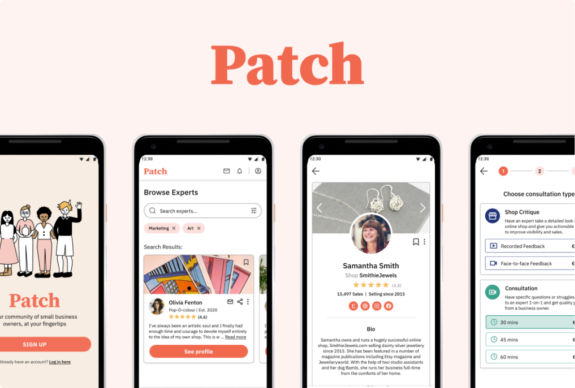
As part of the Careerfoundry UX design course, I responded to the challenge of connecting people seeking expert advice to seasoned professionals via a web application. I went through all stages of the user-centered design process from research, to speaking with my target audience to development-ready prototype (with many more steps in between!) For my project, I identified a specific target audience facing a unique problem.
Opening, running and maintaining a successful Etsy shop is a dream for many. Yet it is becoming increasingly difficult to stand out from the competition. As a jewellery-maker myself, I encountered challenges when opening my own online shop around topics such as price setting, order packaging, shipping and marketing. I set out to explore this problem space further to come up with solutions that could help creators like myself run small online businesses effectively.
How might we design a platform that small business owners will be able to easily find support and resources?
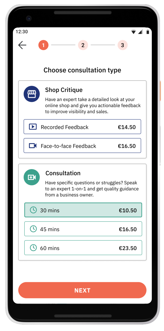
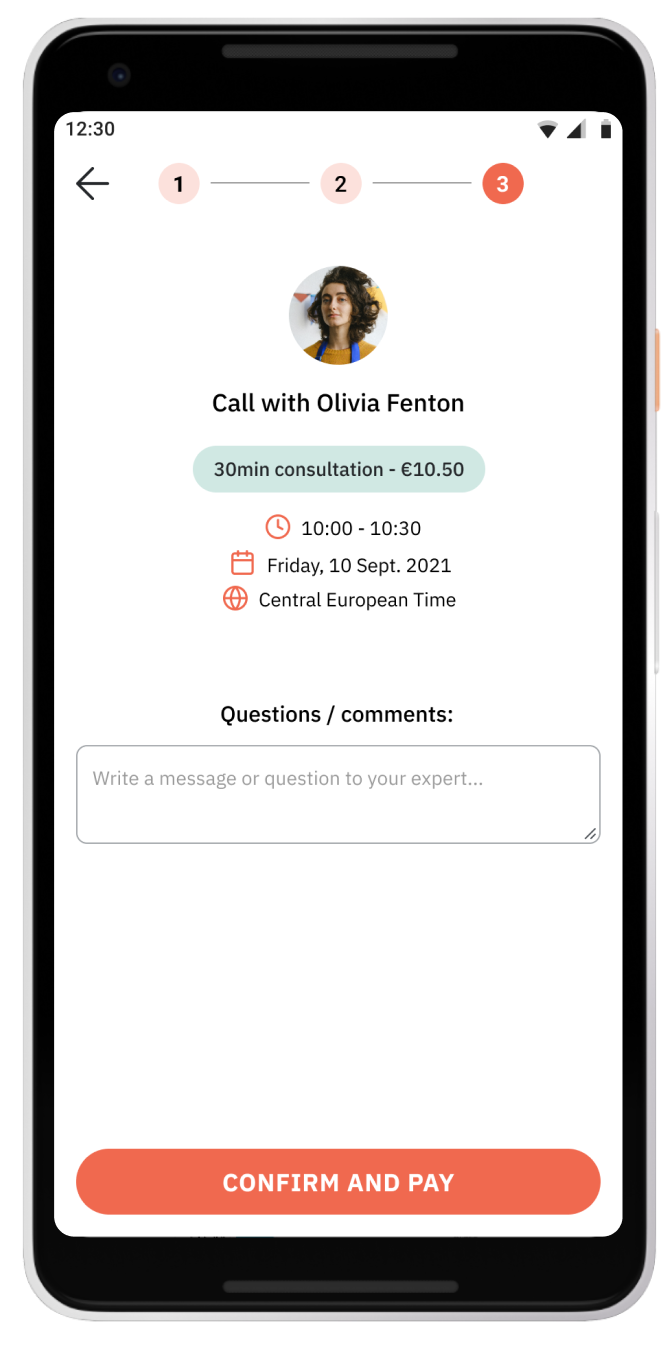
How might we offer a smooth consultation booking process for users who need advice from experts?
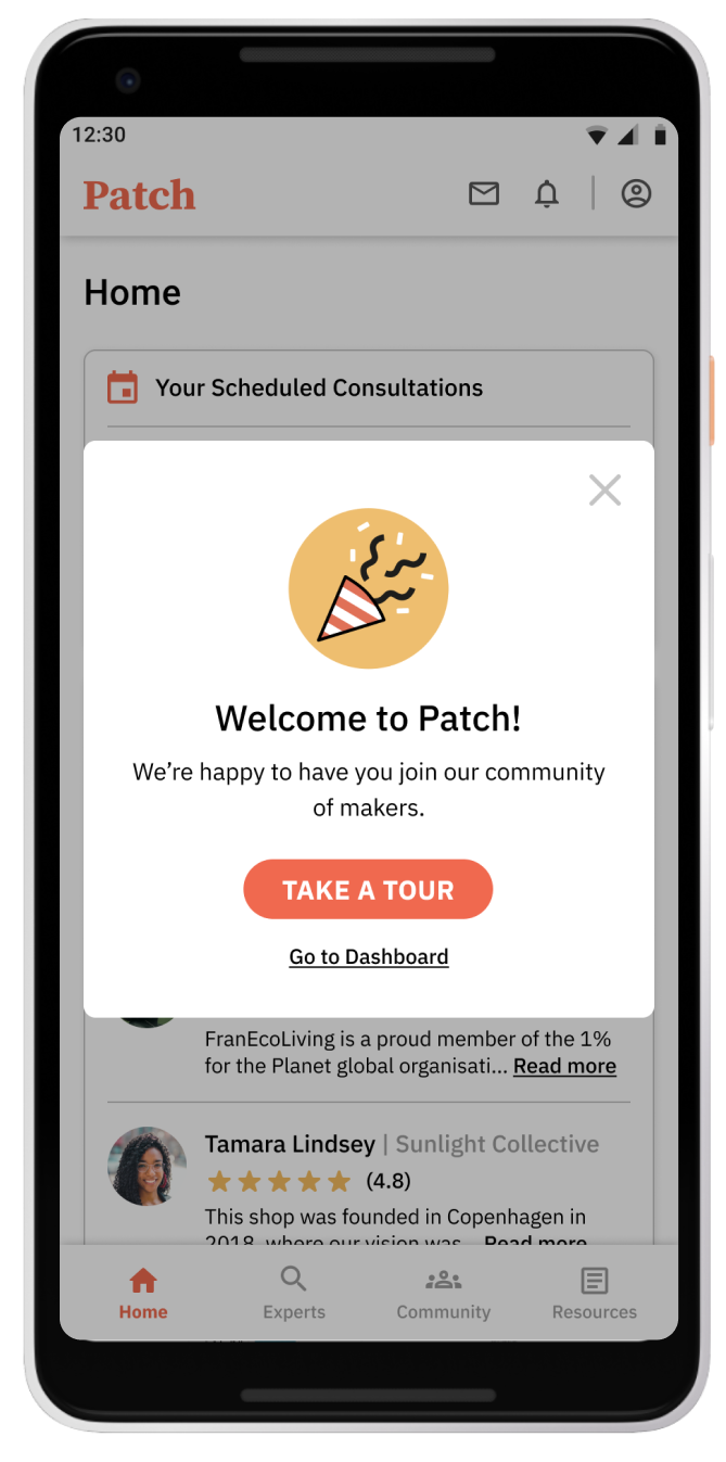
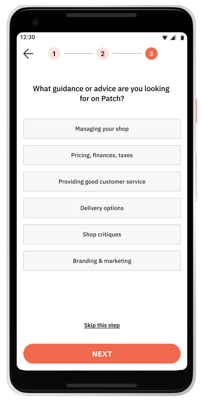
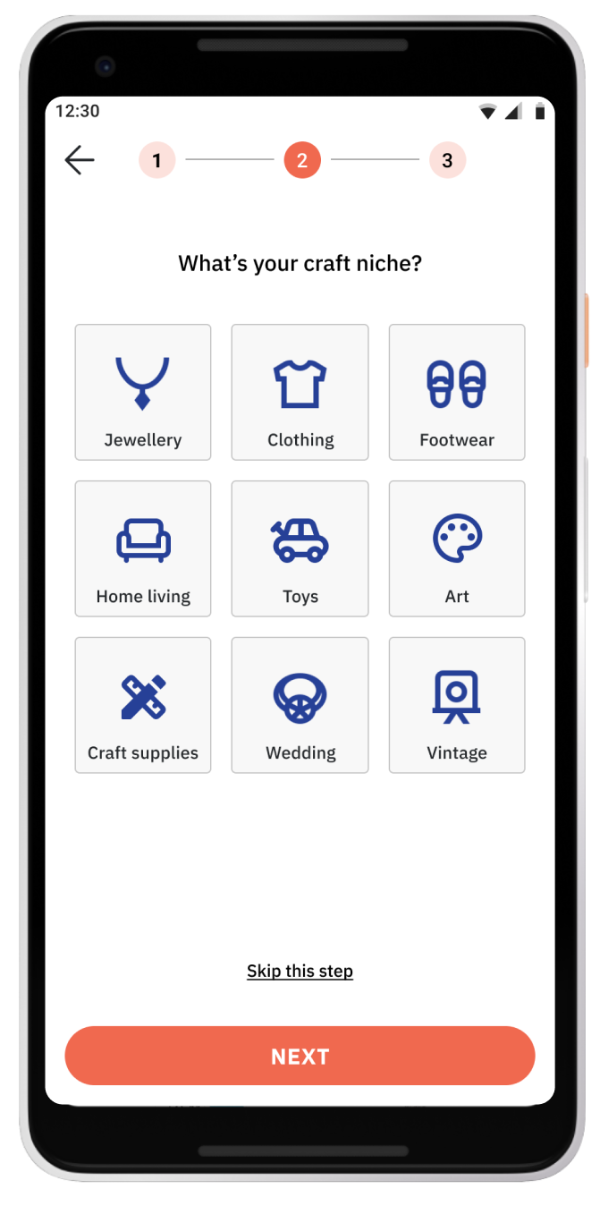
How might we offer a quick onboarding process upon downloading the app?
How might we offer a variety of resources in different mediums to cater to all user segments?

Find out what platform/s crafters are selling on / what they are thinking of selling on, and why
Understand what challenges crafters face in the set-up and subsequent running of their online shops
If the participant doesn’t yet have an online shop, what the challenges they perceive are
Find out what resources and tools they utilised to help them get started and run their businesses
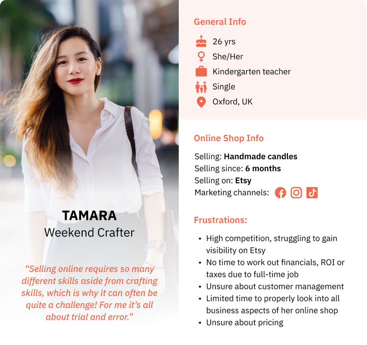
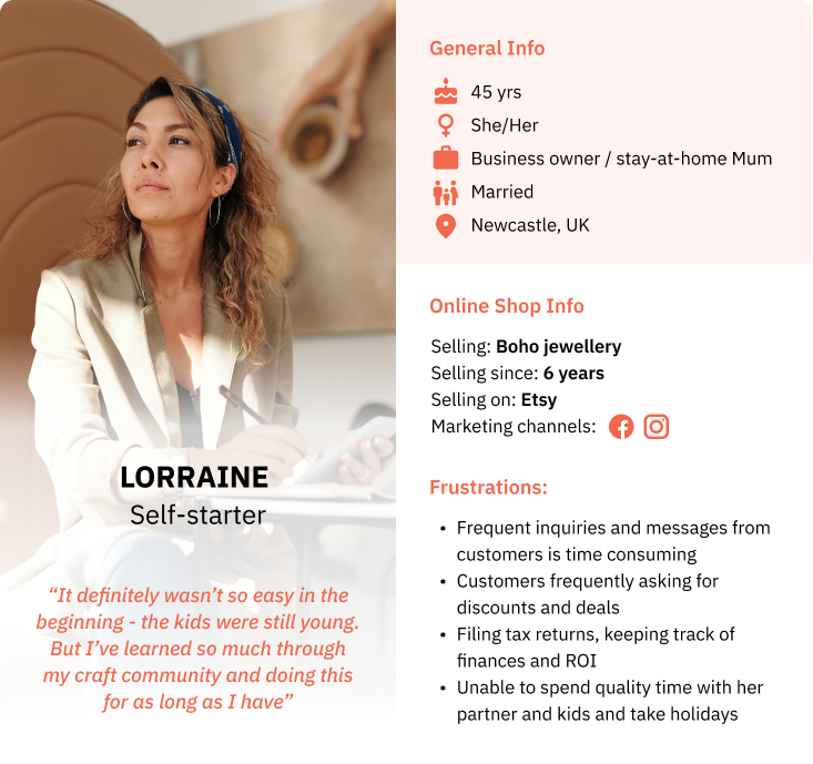
I conducted interviews with three crafters in varying stages of online shop maturity as part of my initial research. This was my intention, as I wanted to find out whether the challenges that new online shop owners faced (anywhere from 6 months to a year) and challenges that seasoned shop owners faced (5+ years) had any overlaps or crossovers. The following are the crafters' profiles:
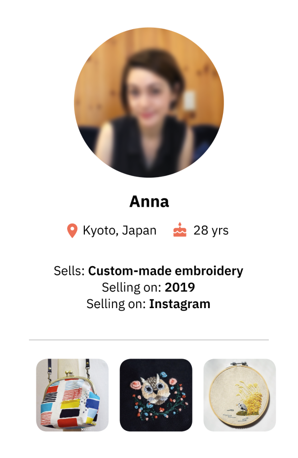
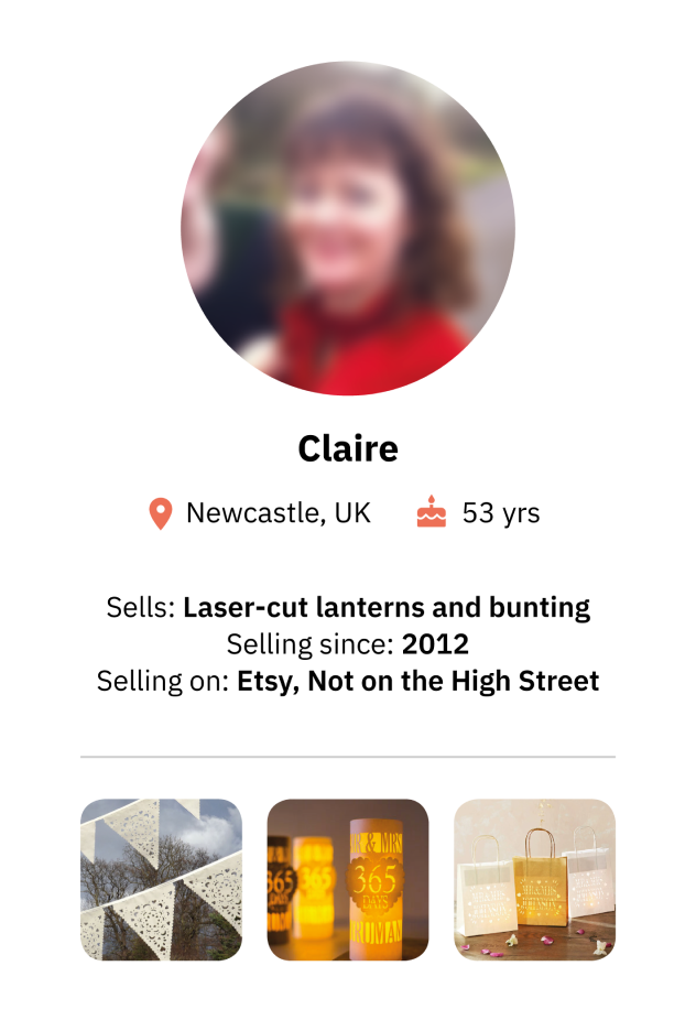
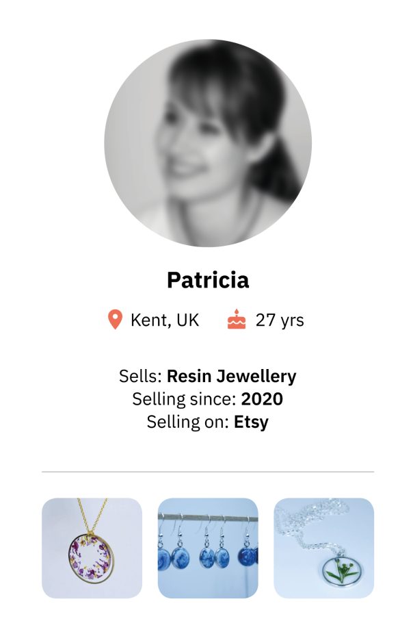
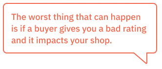
The interviews were illuminating in that I was able to pinpoint several main themes that often came up in discussion. The following are some soundbites from the interviews:
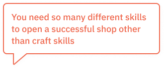
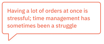
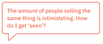
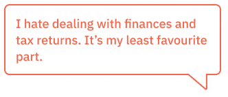
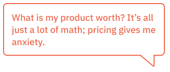
Based on the interviews, I created two personas to represent the segments within my target audience; one being a crafter with a newly opened online shop, and one being a more experienced shop owner. It was important to create these two personas as my app had to include features that appealed to both and could be useful to both personas.
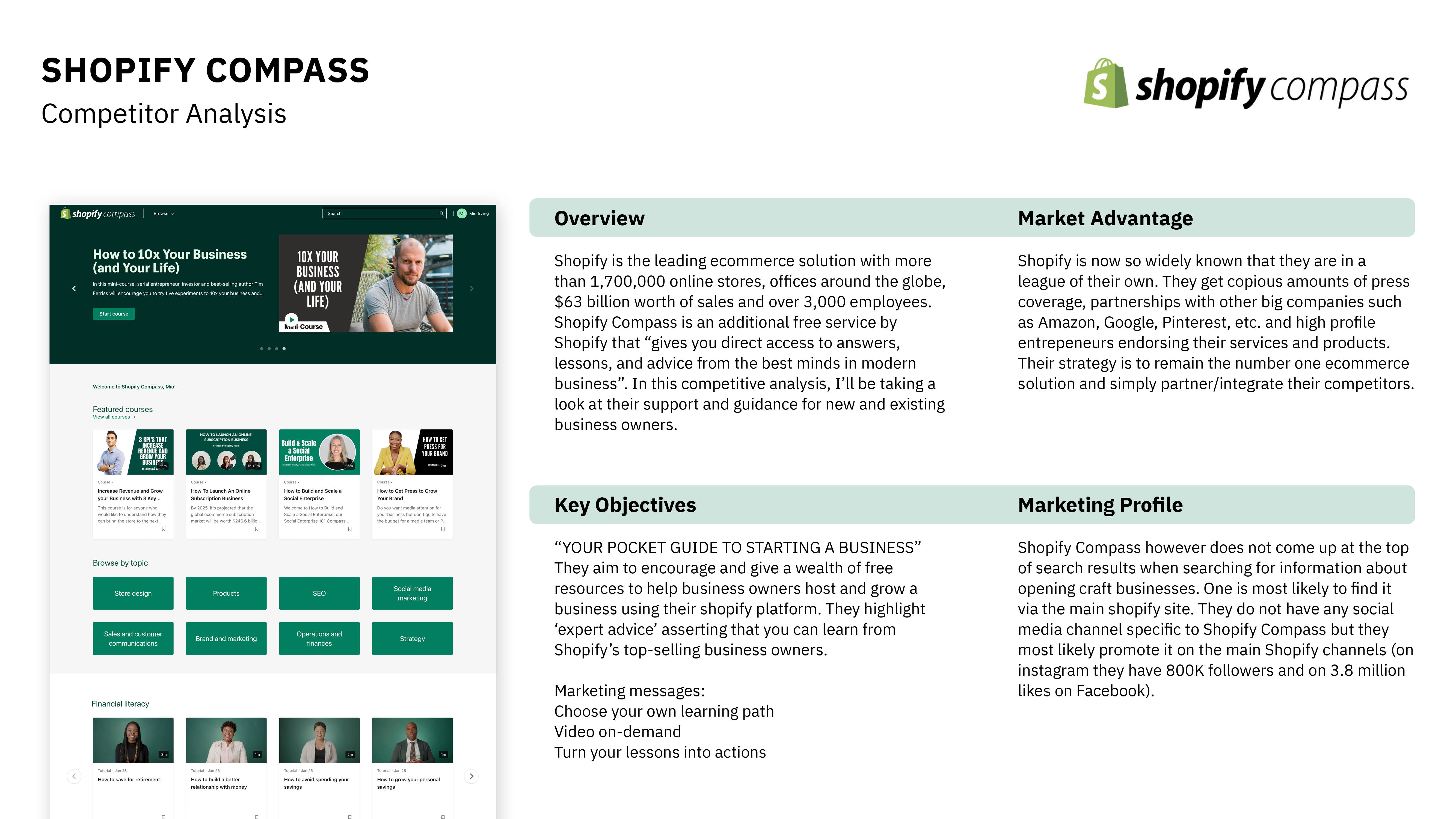
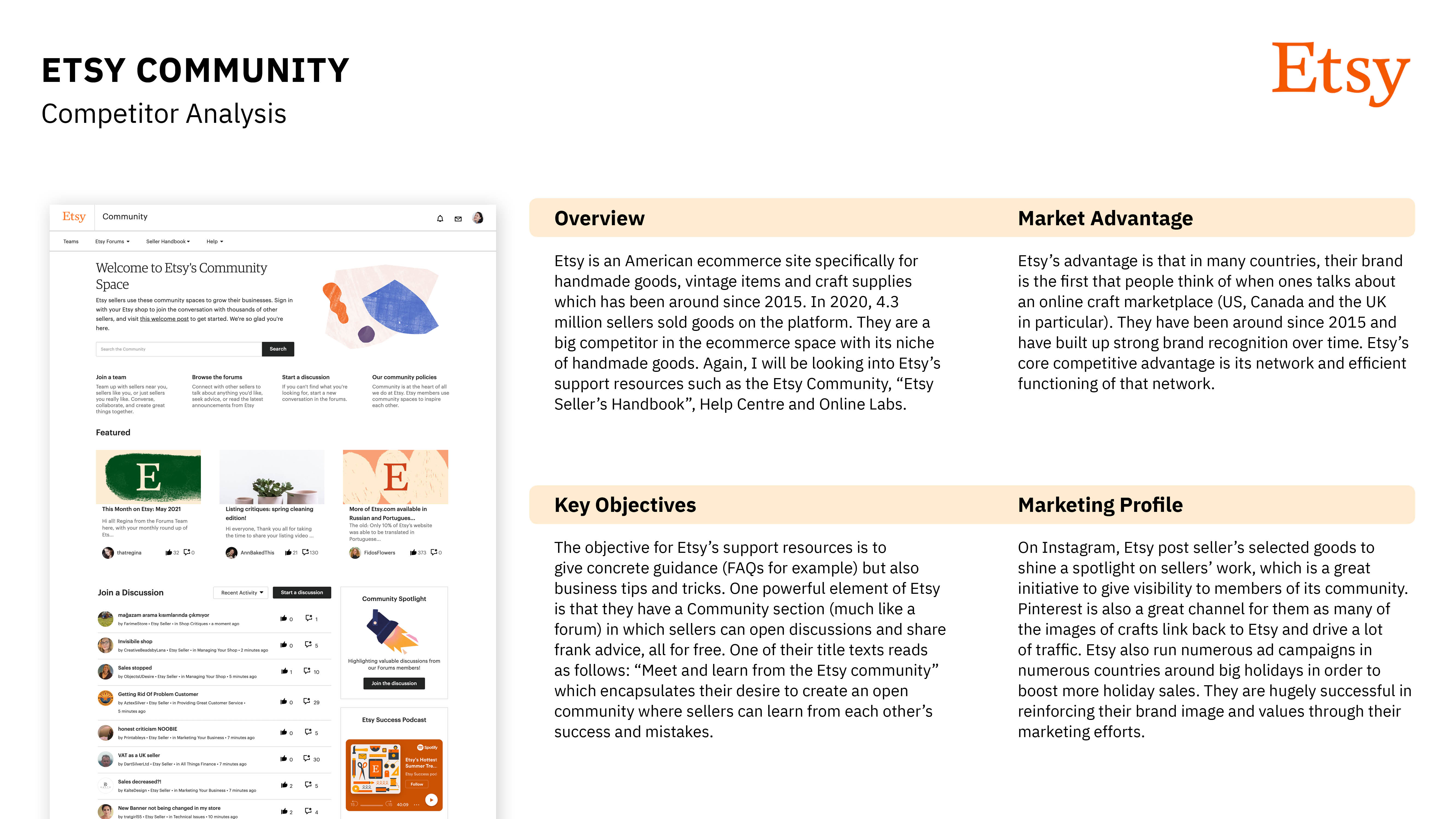
I have analysed companies that are big players in the craft/e-commerce market that specifically have extensive resources and various forms of guidance available on their sites for new business owners. I focused specifically on the support elements of these platforms as this is similar to what my app will be offering in terms of features.

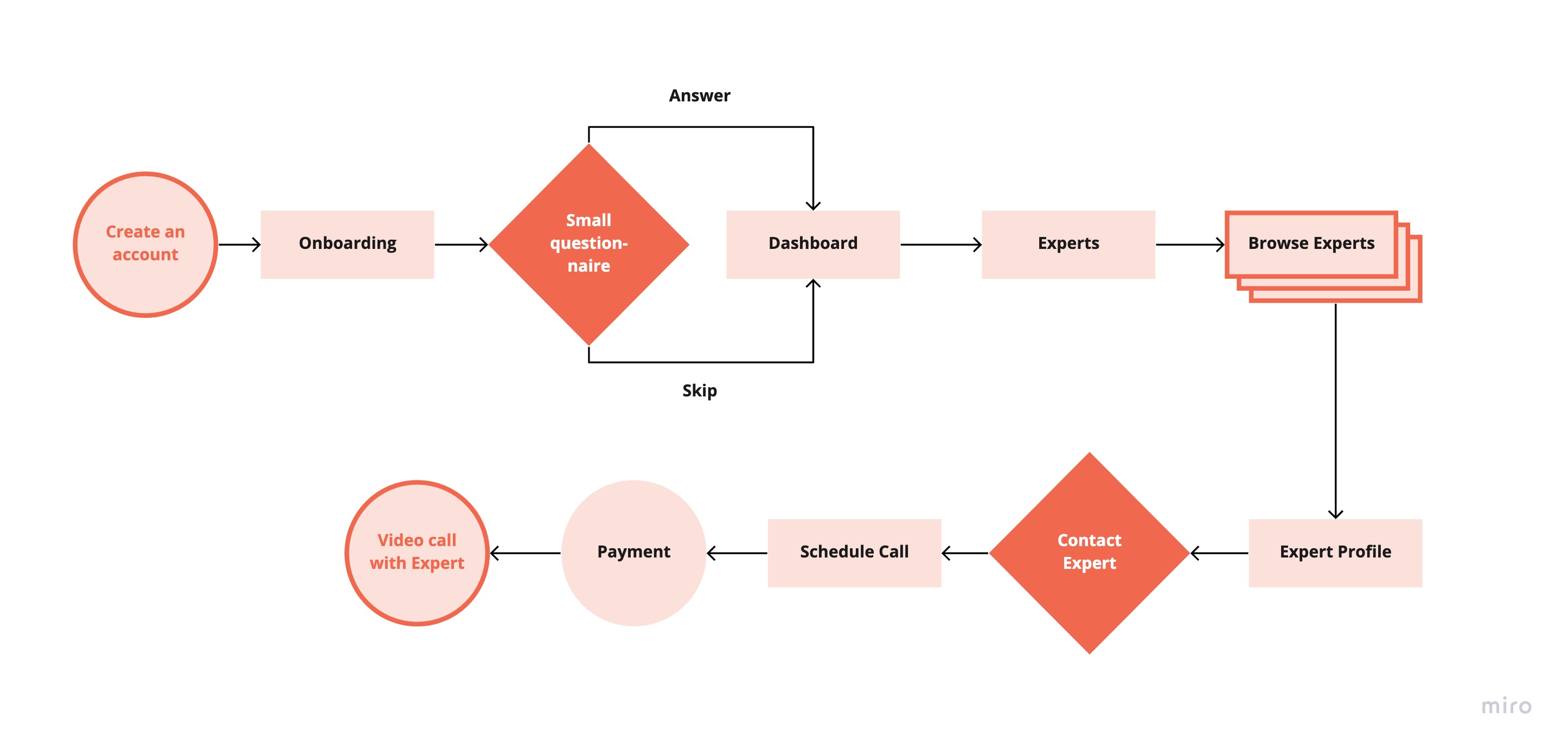
Weekend Crafter
The entry point for Tamara is downloading and creating an account on the app.
Tamara will have fulfilled her objective when she receives answers to her questions by an expert on the platform.
Create an account on the app
Go through onboarding
Browse experts and select a highly rated seller
Schedule a ‘shop critique’
Payment
Have a video call with expert

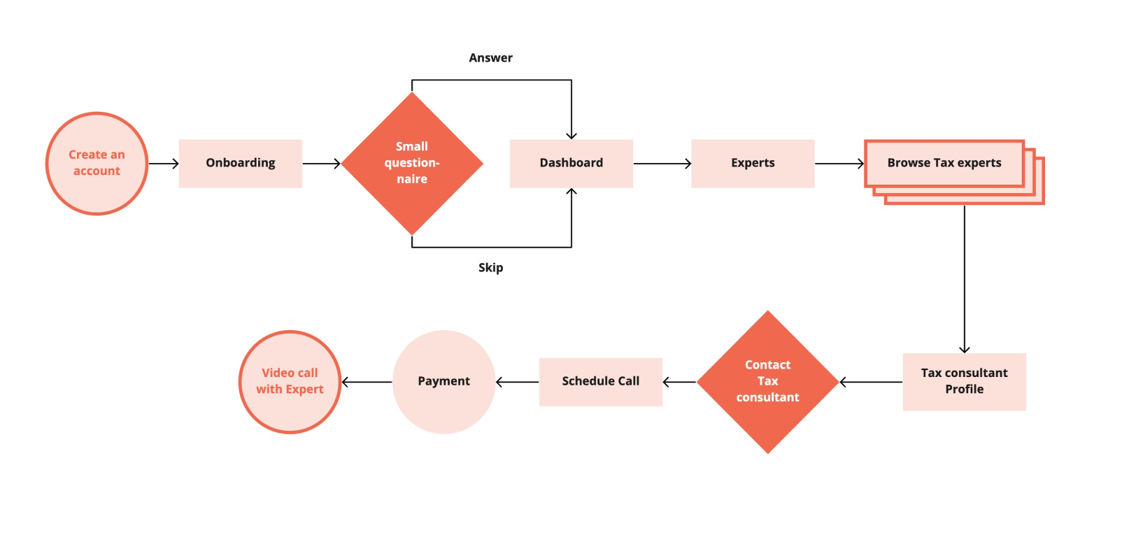
Self-Starter
The entry point for Lorraine is downloading and creating an account on the app.
Lorraine will have fulfilled her objective when she finds and schedules a call with a tax consultant on the platform.
Create an account on the app
Go through onboarding
Browse tax consultants in the tax section
Read reviews and select a consultant
Schedule a call
Have the call and agree on next steps
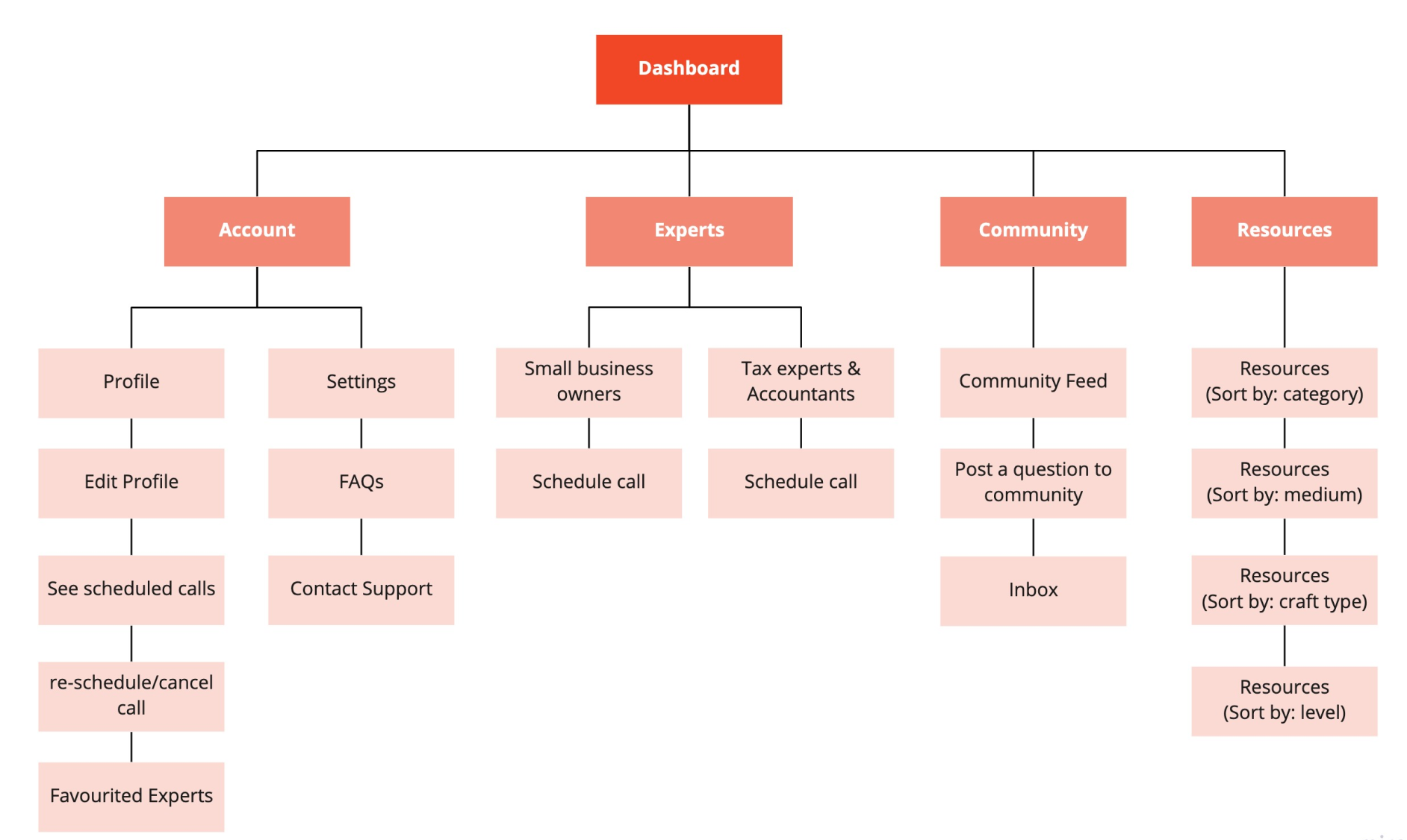
I did a card sort with 6 participants on Optimal Workshop and was able to reduce six main categories in my original sitemap to the below sitemap consisting of 4 major categories. I believe that this navigation will be much simpler and more intuitive for the user to navigate.
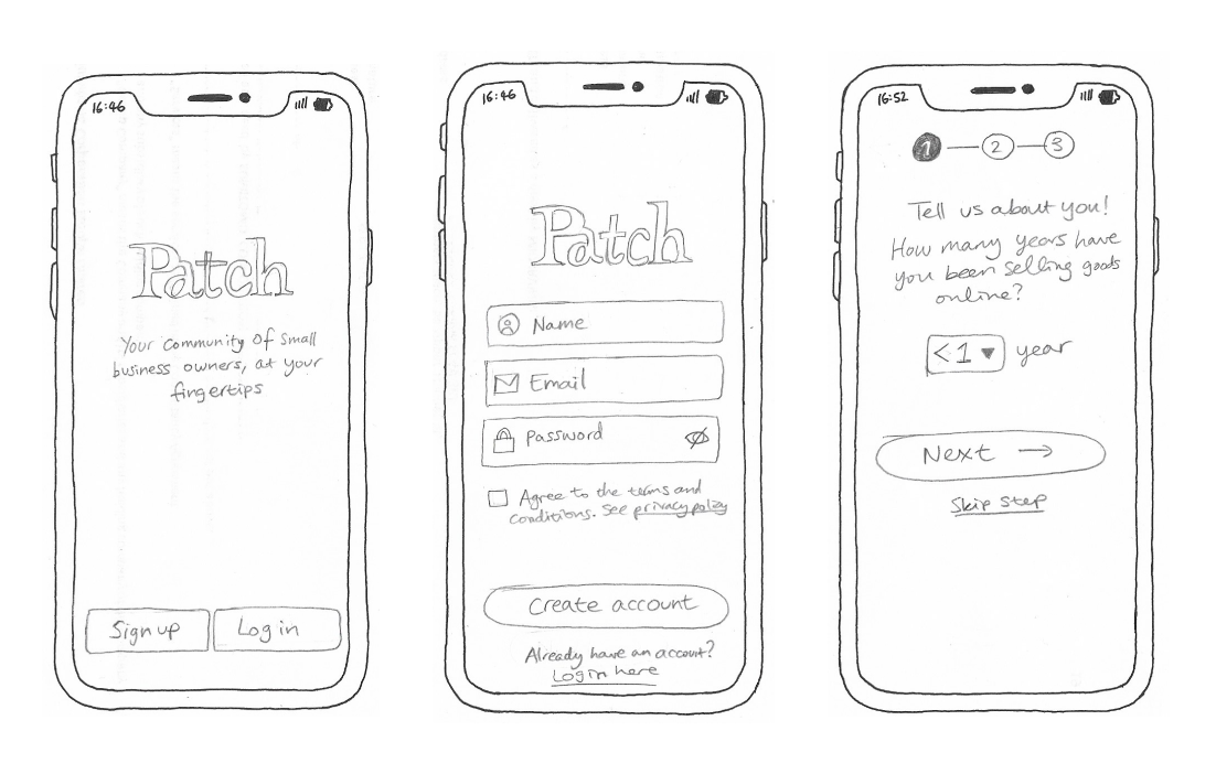
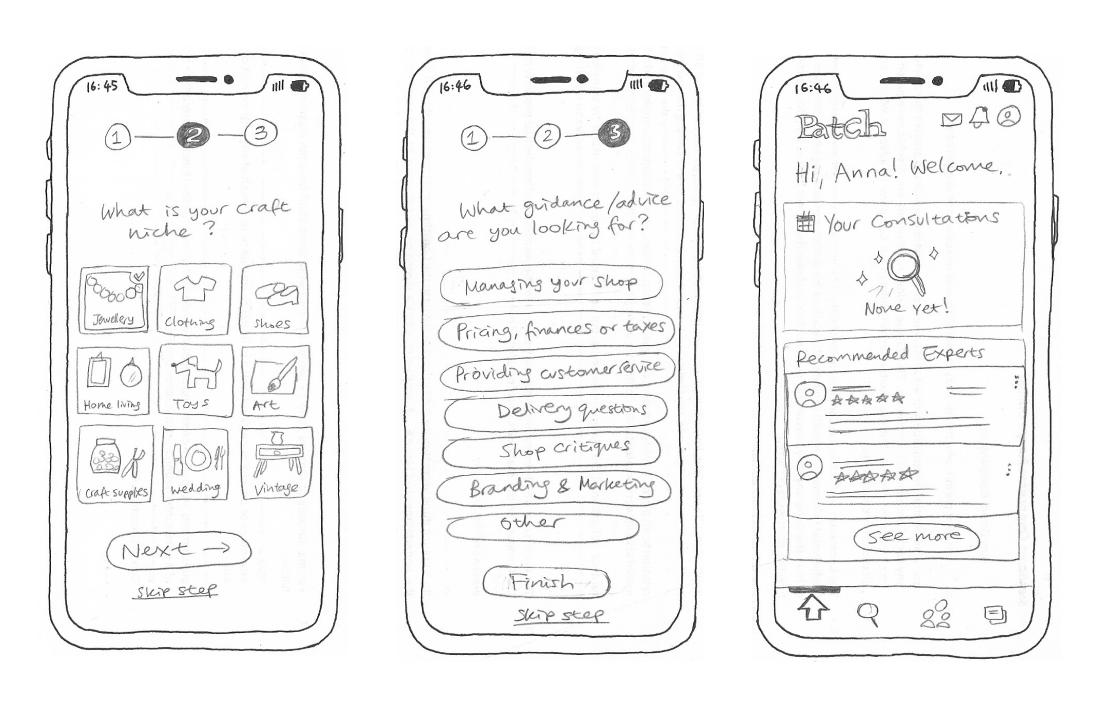
Rough sketch
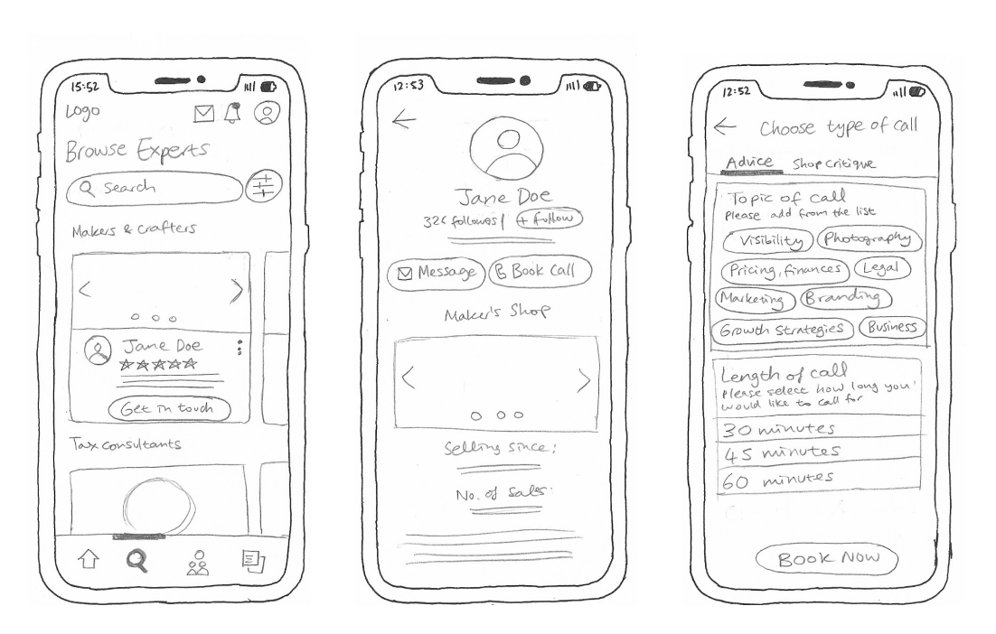
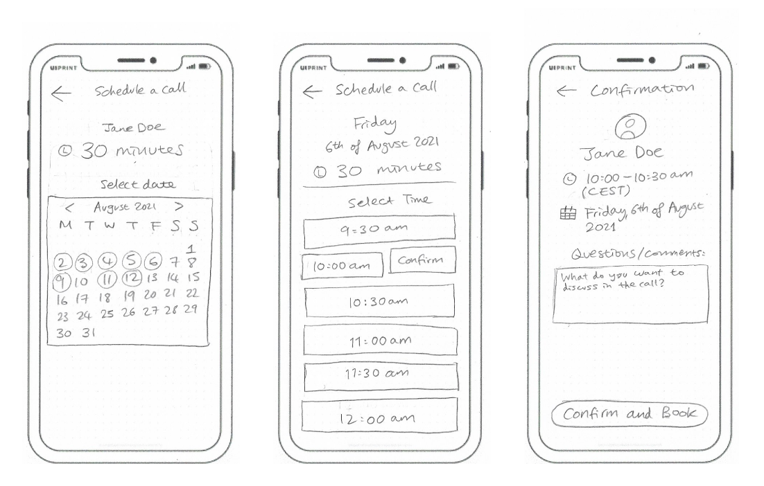
Rough sketch
Mid-fidelity created in Figma
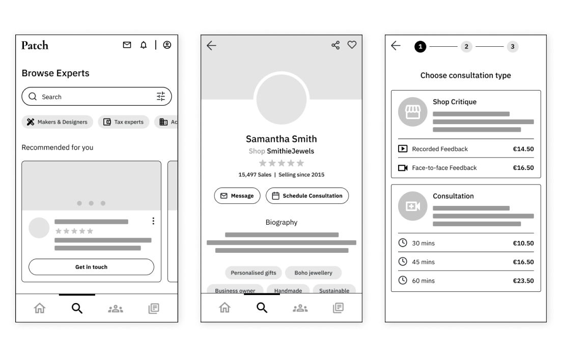
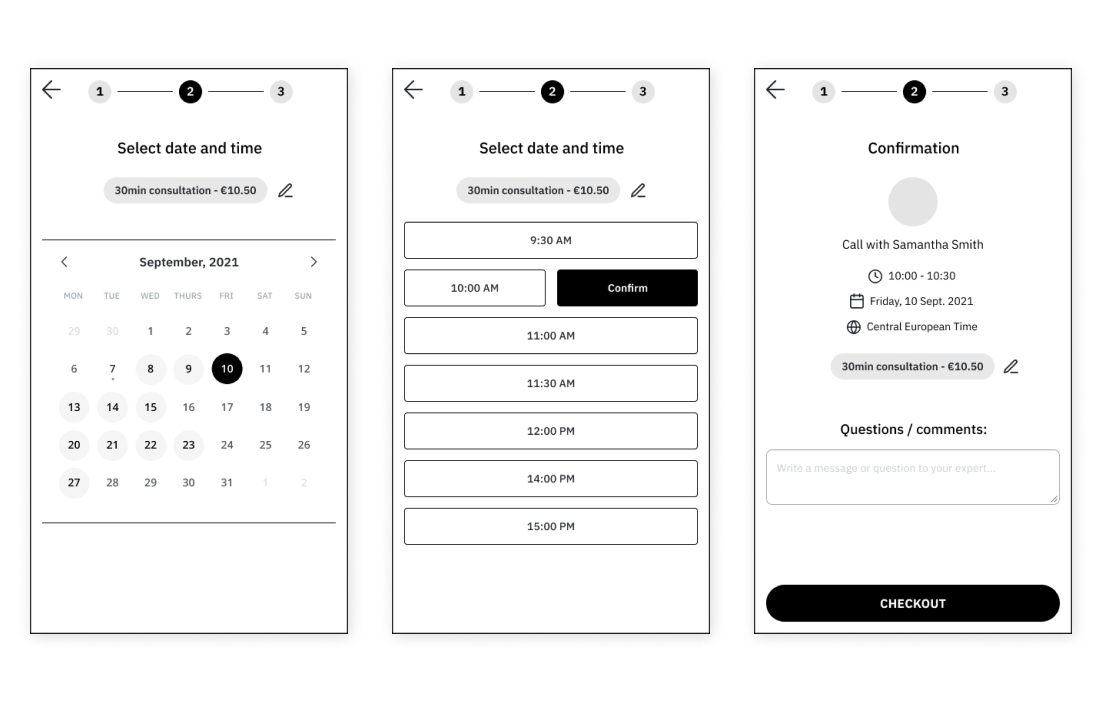
Rough sketch
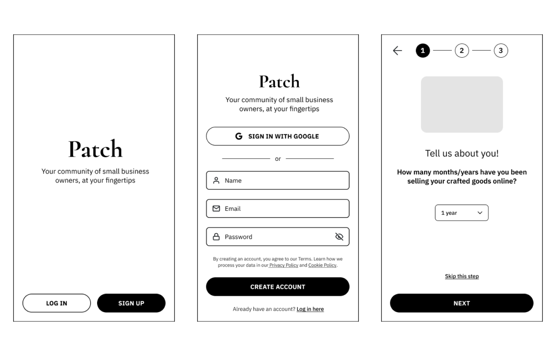
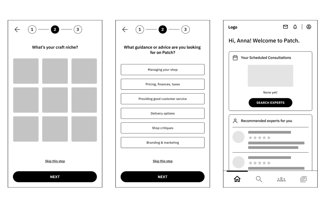
A clickable prototype was created with the mid-fidelity wireframe on Figma in order put the flows/design to test via usability tests.
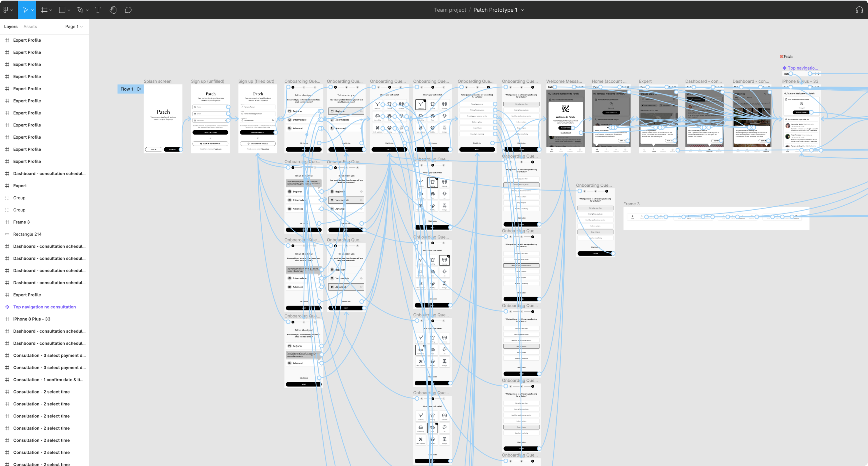
I conducted user tests with six people individually in 1:1 sessions. Two of the tests were in person and Four were conducted remotely on a video tool called Lookback. Four of the
participants were female and two were male. Their ages ranged from 25 - 55 years old.
It was important to test with people of varying ages since according to Etsy’s 2015 report, in the US the median age of sellers’ is 39
years. Another interesting thing to note is that 86% of Etsy sellers are female (see report here).
The goal for this usability test was to find out whether users can quickly and successfully understand the basic features of the app and where they are located, as well as book a theoretical consultation with an expert.
See whether testers understand the purpose of the app during the onboarding without prior explanation
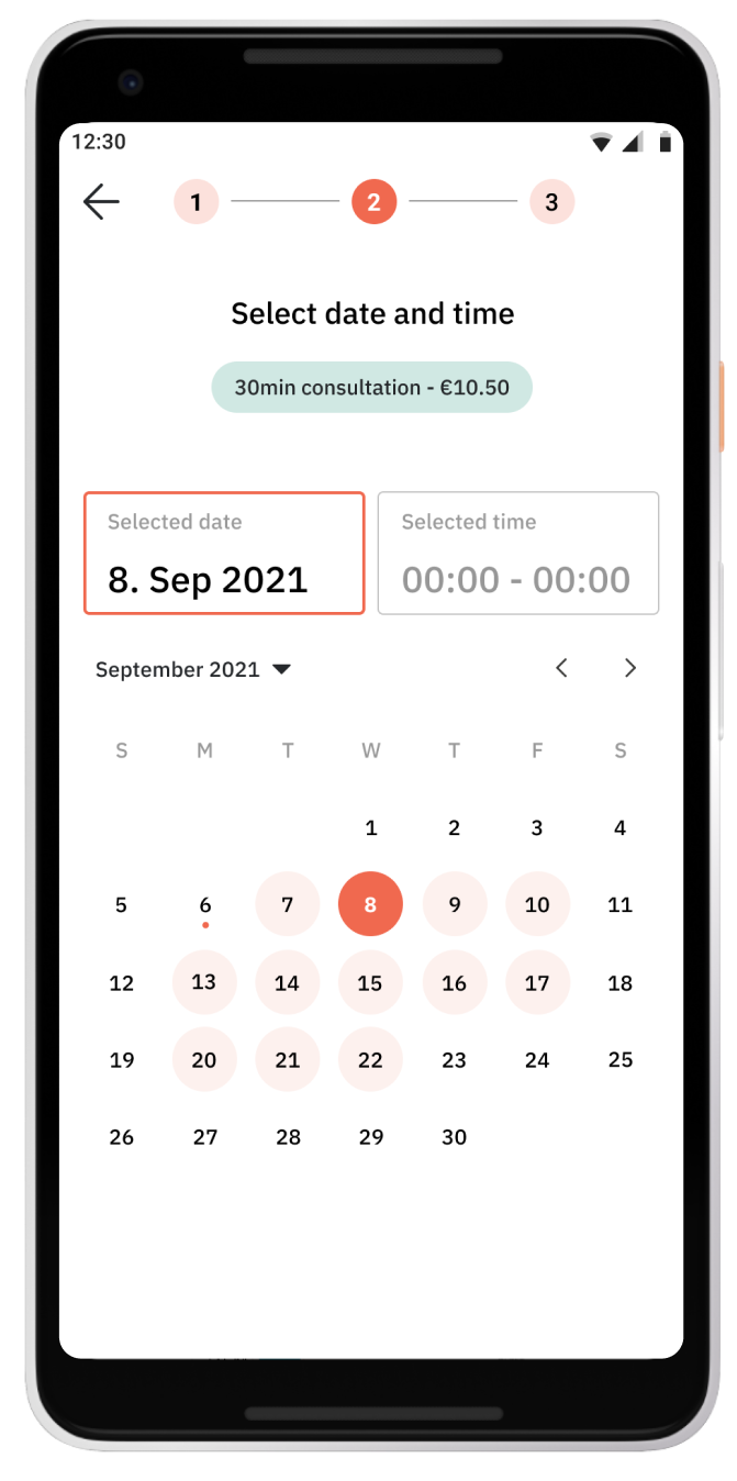
See whether participants can quickly and easily book a consultation with a craft business expert
See whether participants understand the purpose of each page on the navigation
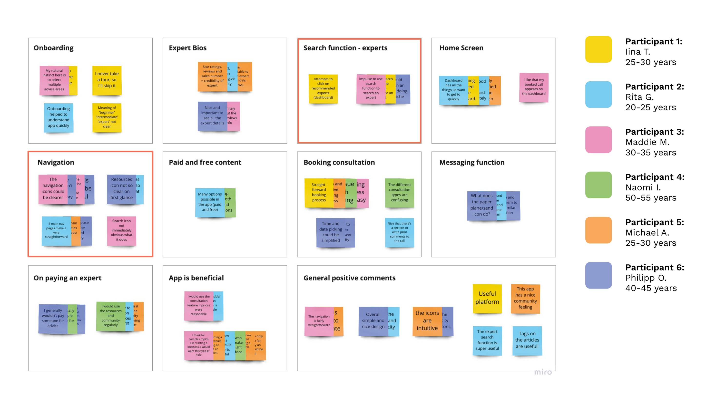
I transferred important quotes and feedback onto post-its on Miro. I then grouped the results into major categories in order to evaluate the results and identify the most pressing issues of usability. The categories highlighted in orange (“Navigation” and “Search function - experts”) were big topics that were reoccuring and needed improvement.
High-fidelity Design
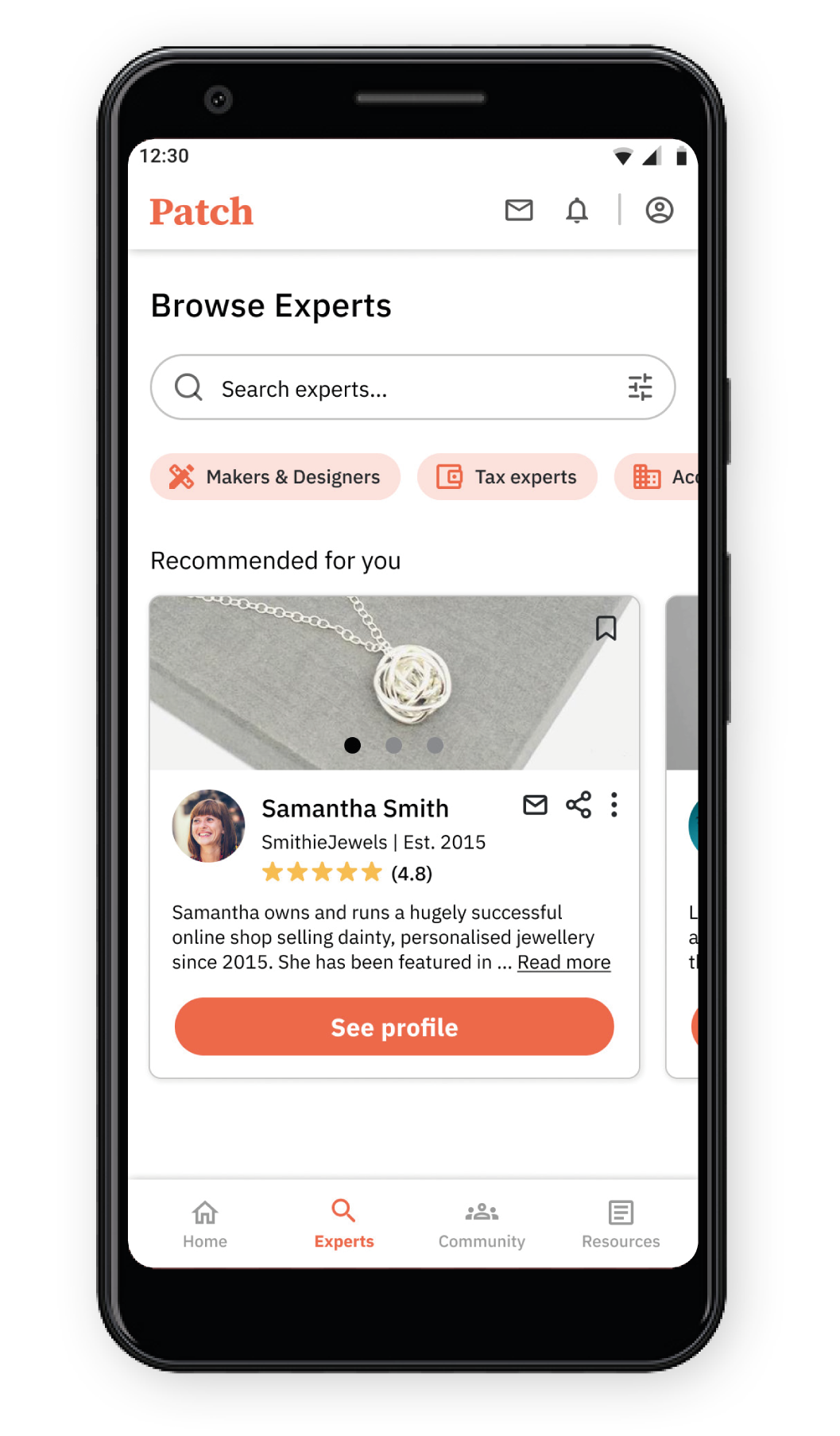
Before filter/search applied
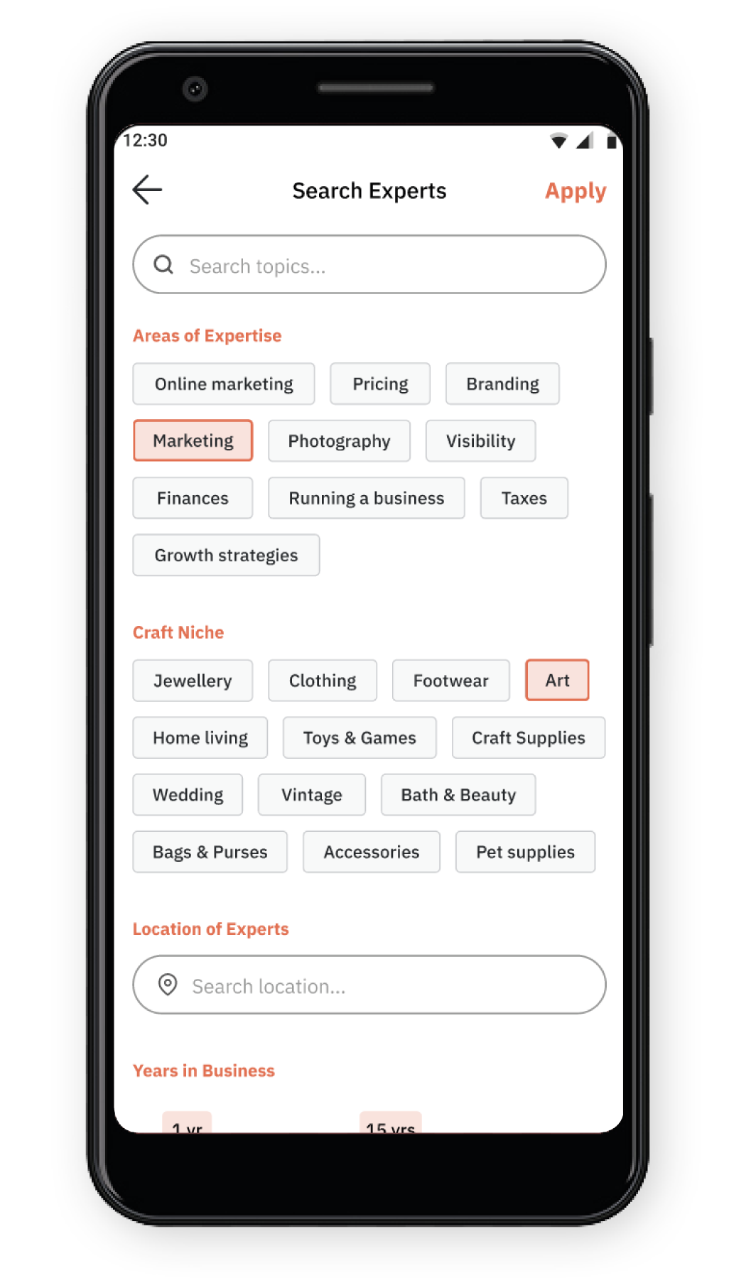
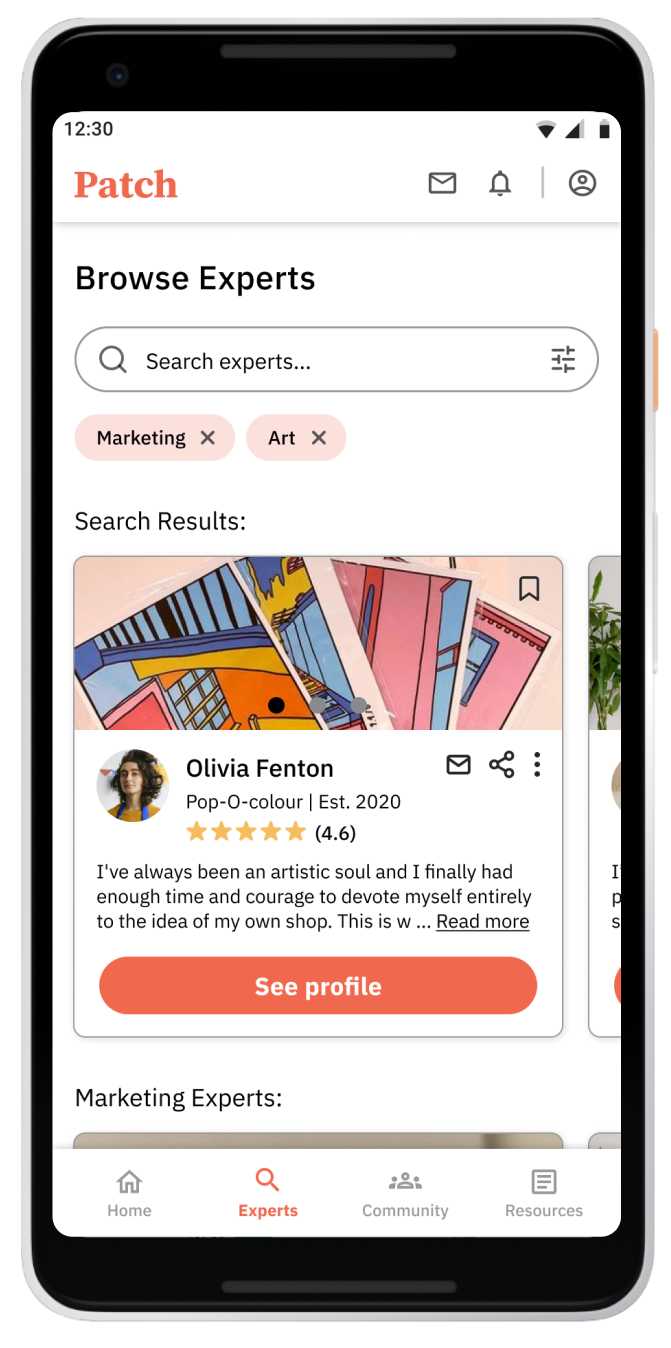
I pre-selected a few of the filters so that when a user clicks on the prototype, they can see how the filter works
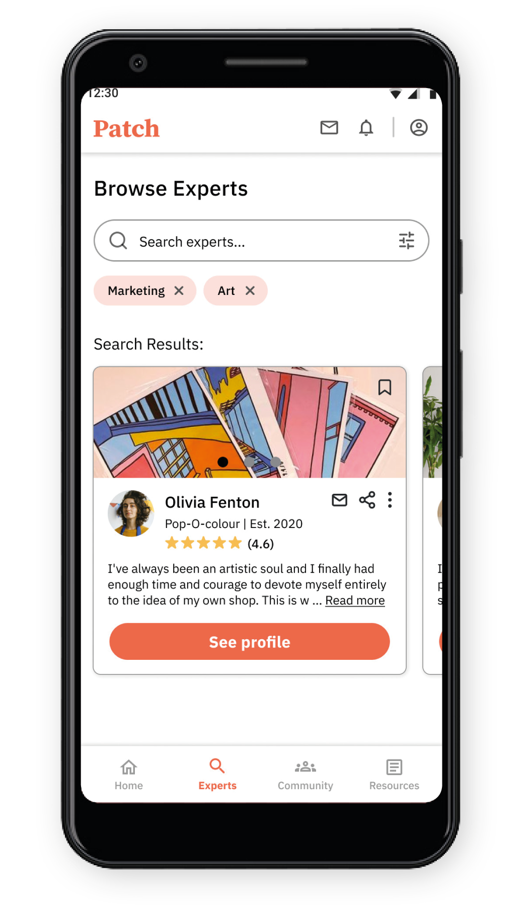
The search results are shown with the applied filters visible above the results
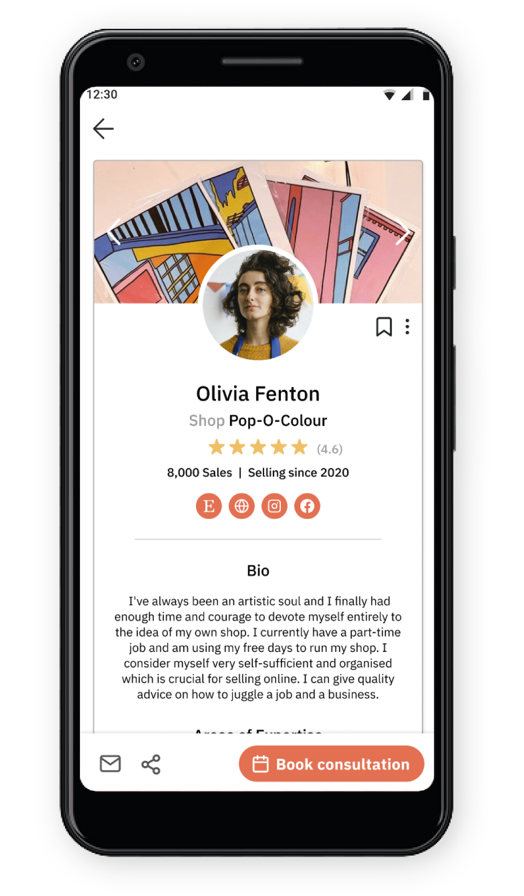
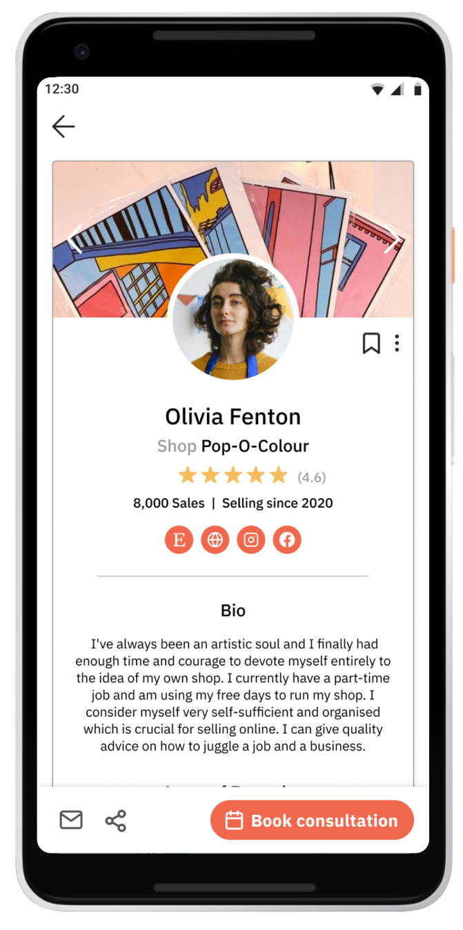
This is the bio of the expert at the top of the search result
High-fidelity Design
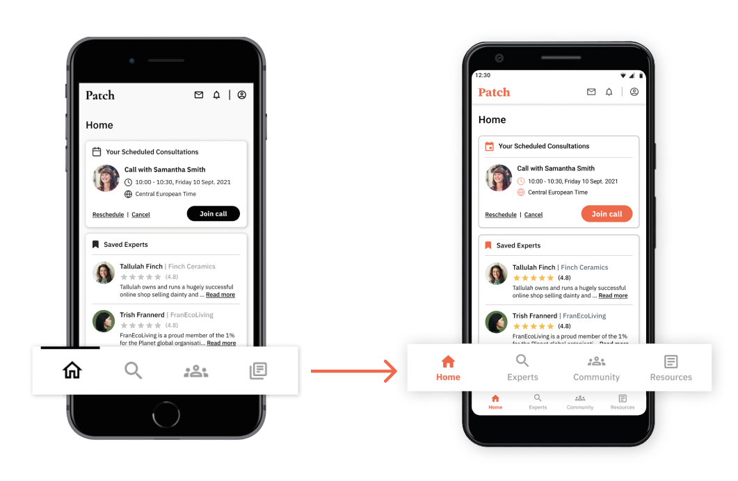
I realised during the usability tests that the bottom navigation bar could be slightly confusing for some (especially those that skip the onboarding tour). I therefore exchanged the ‘resources’ icon and also added labels under each of the icons in order to make the navigation crystal clear to the user. I also followed Google Material guides to adjust the sizing of the navigation bar itself as well as the icons and text within.
High-fidelity Design
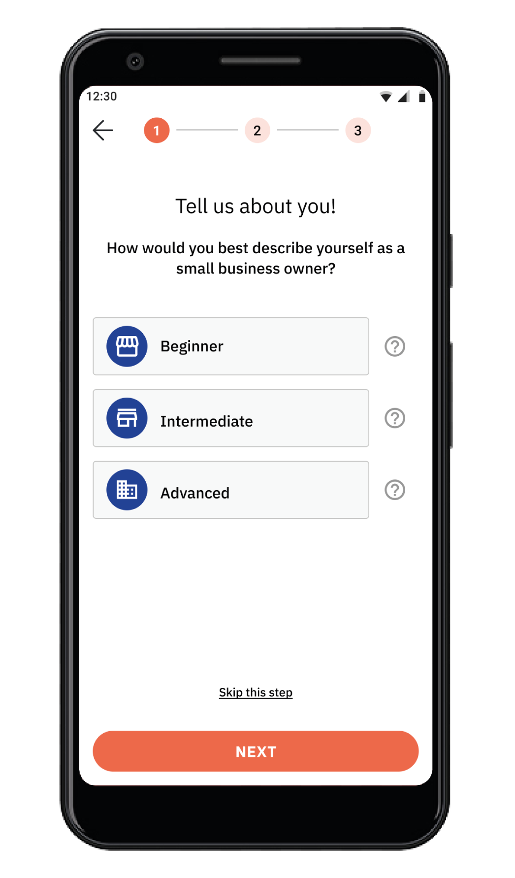
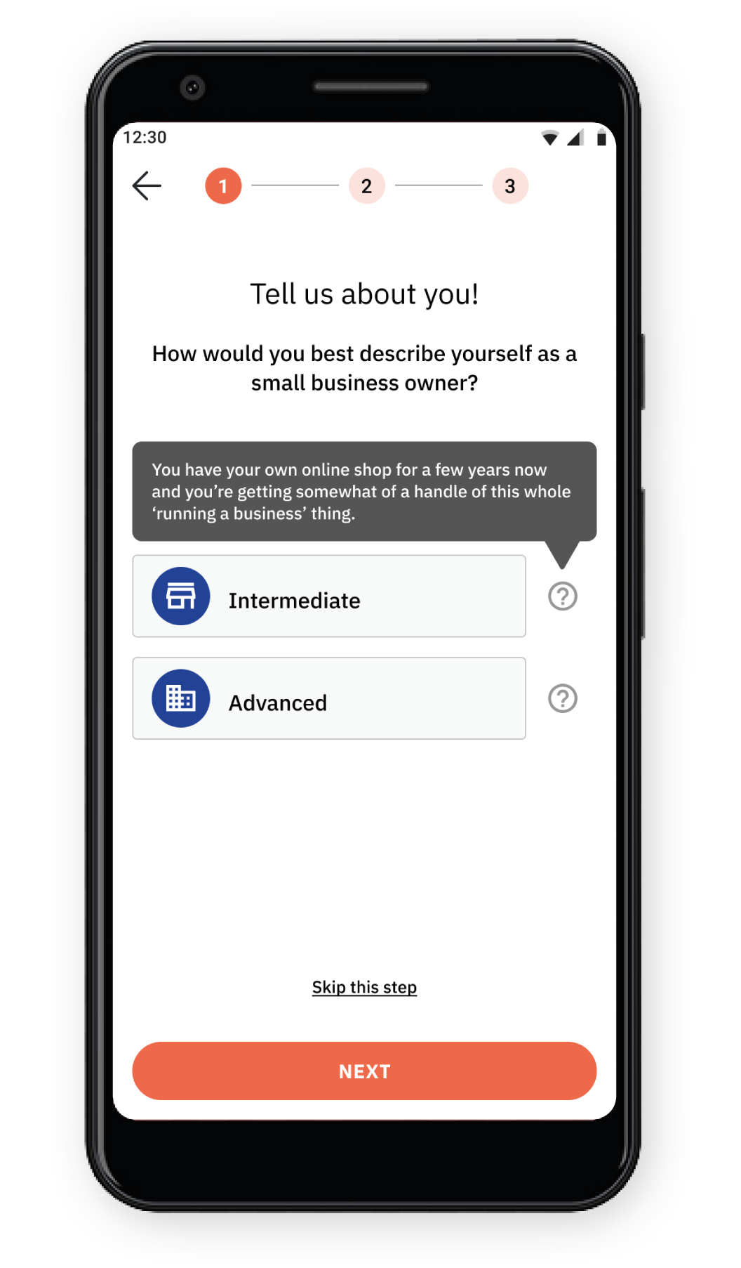
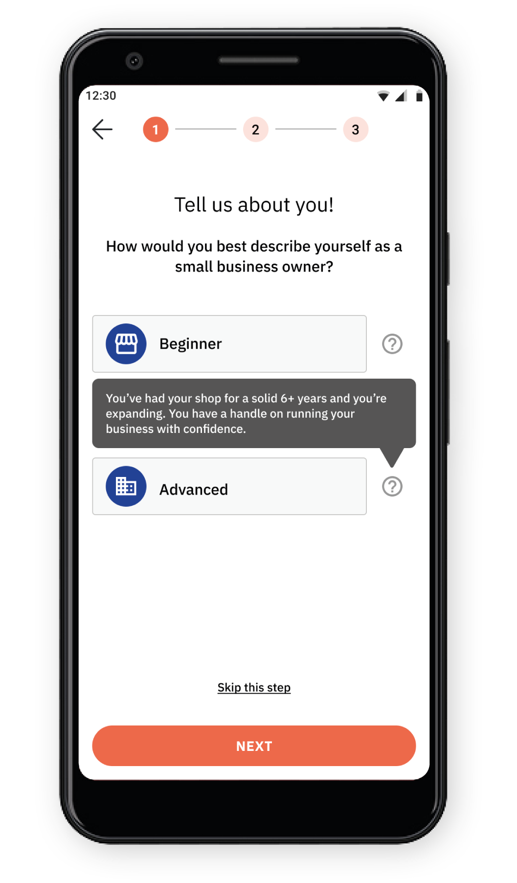
One tester pointed out that they didn’t know what each ‘level’ meant on my original design
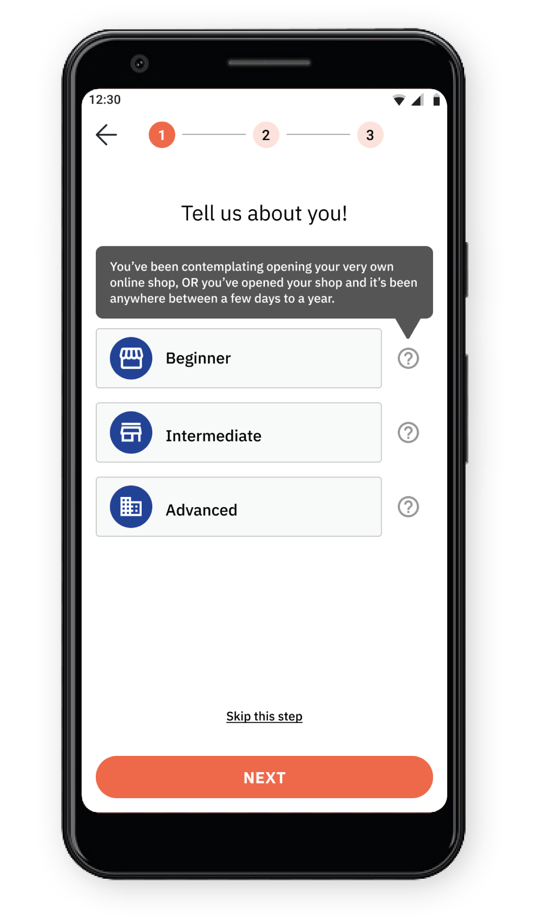
I added descriptors that pop up when the “?” is tapped on so that users can get a better idea
High-fidelity Design
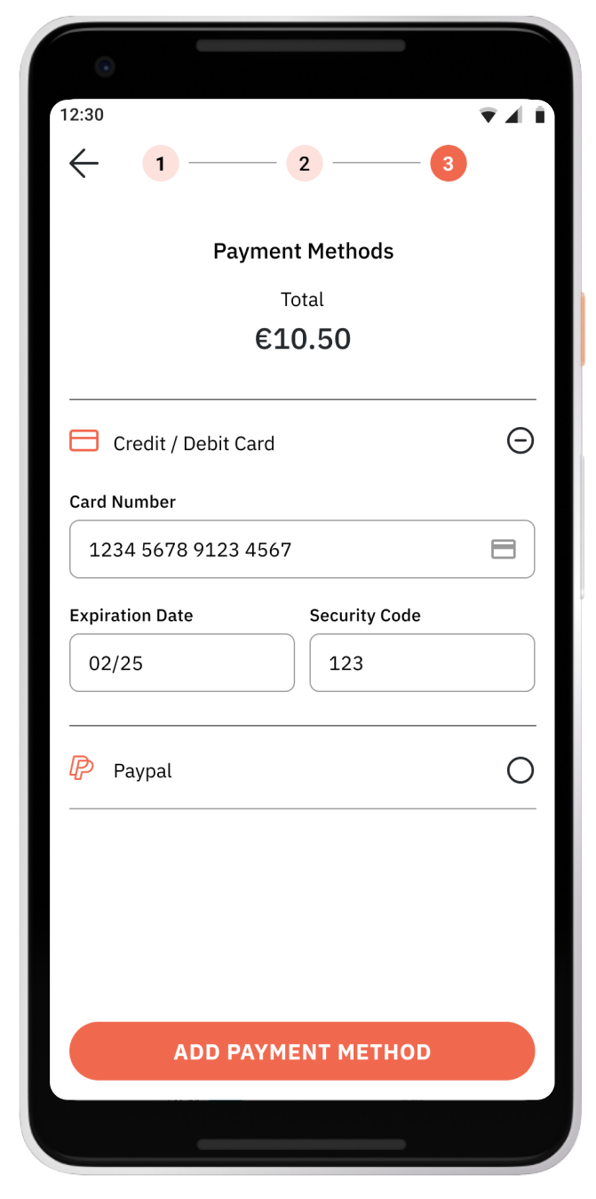
High-fidelity Design
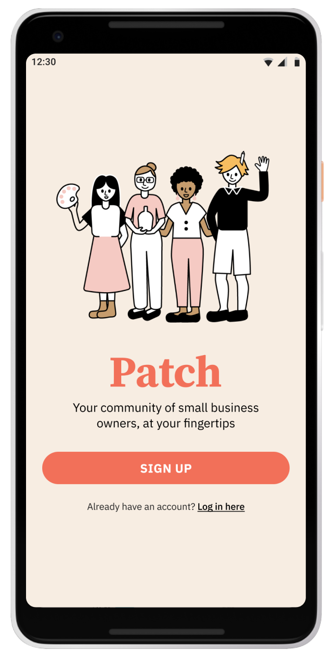
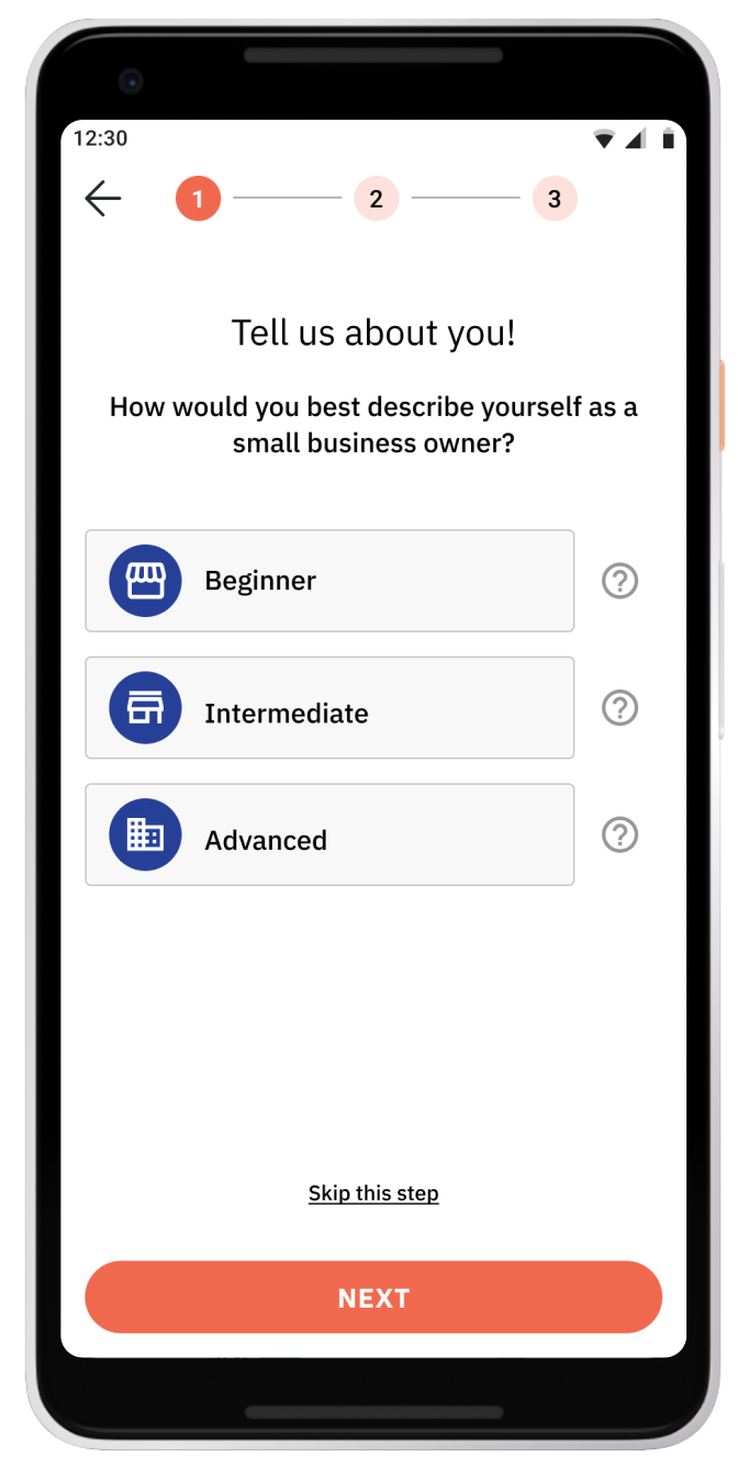
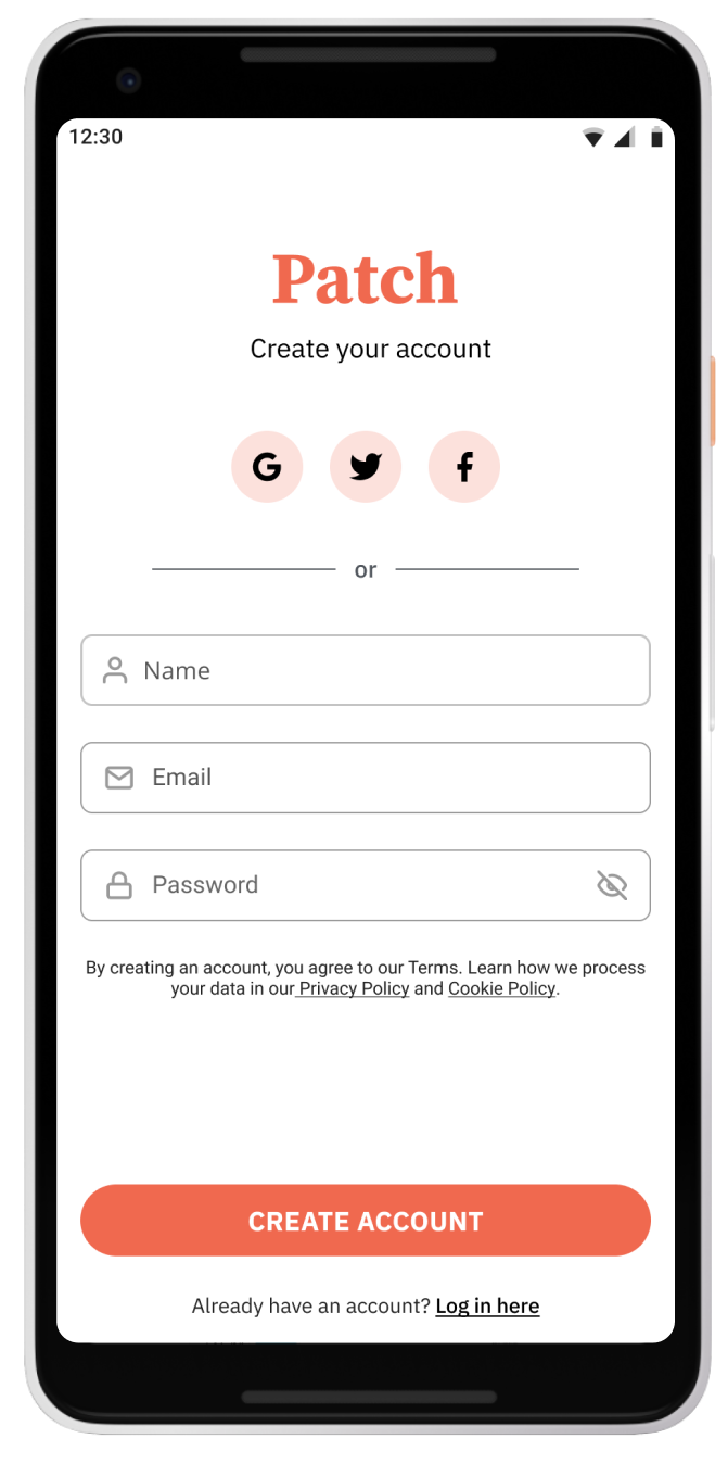
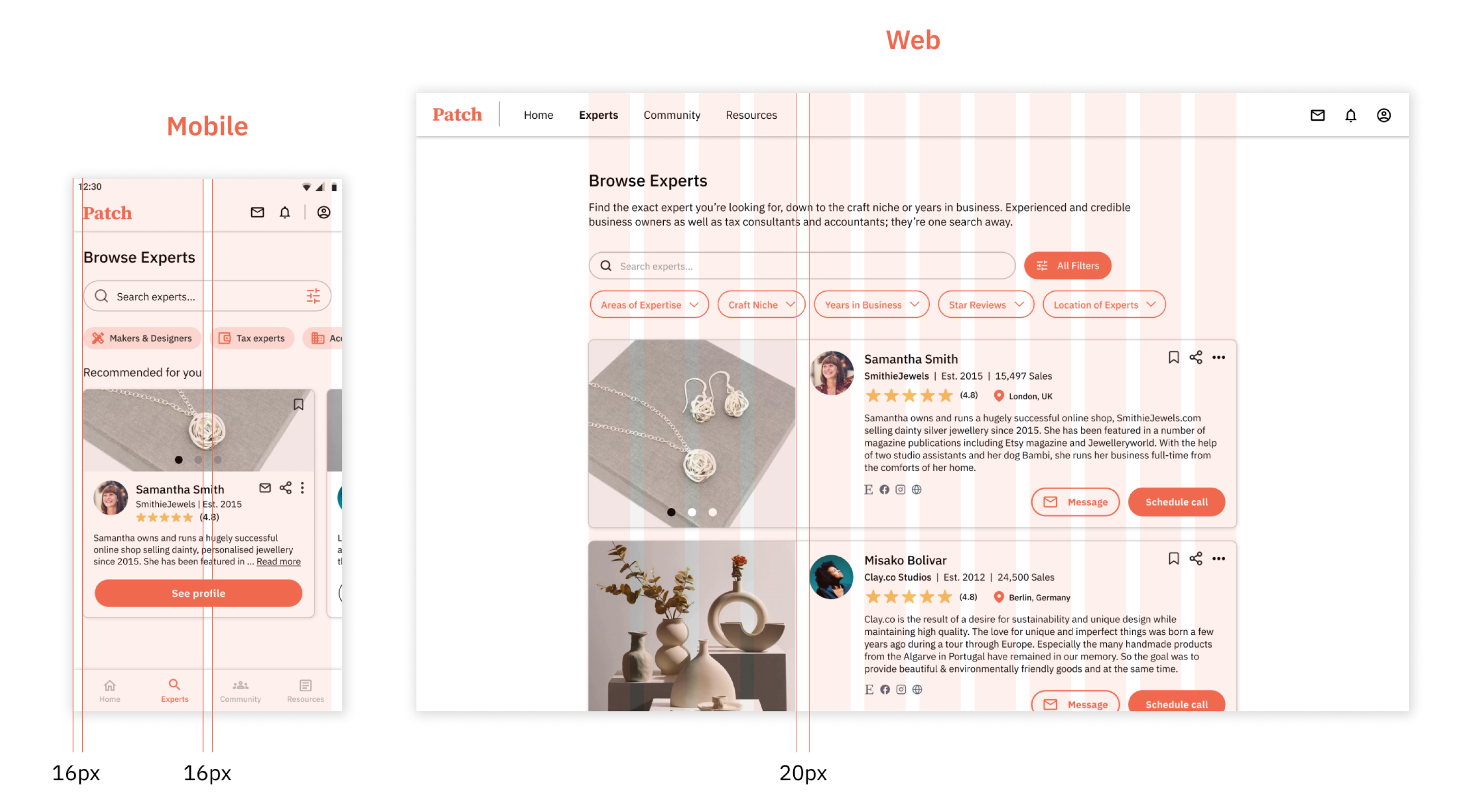
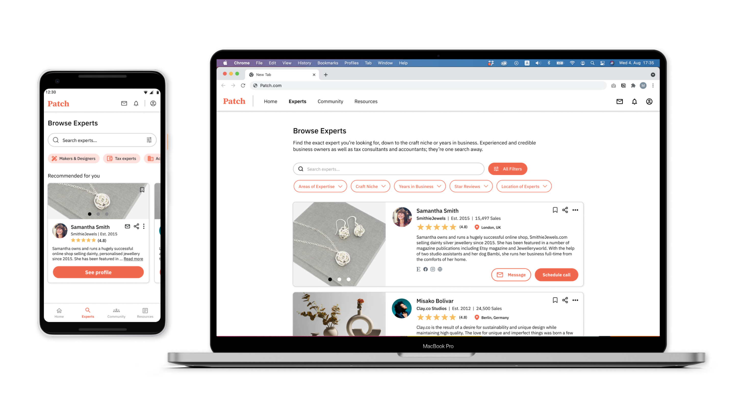
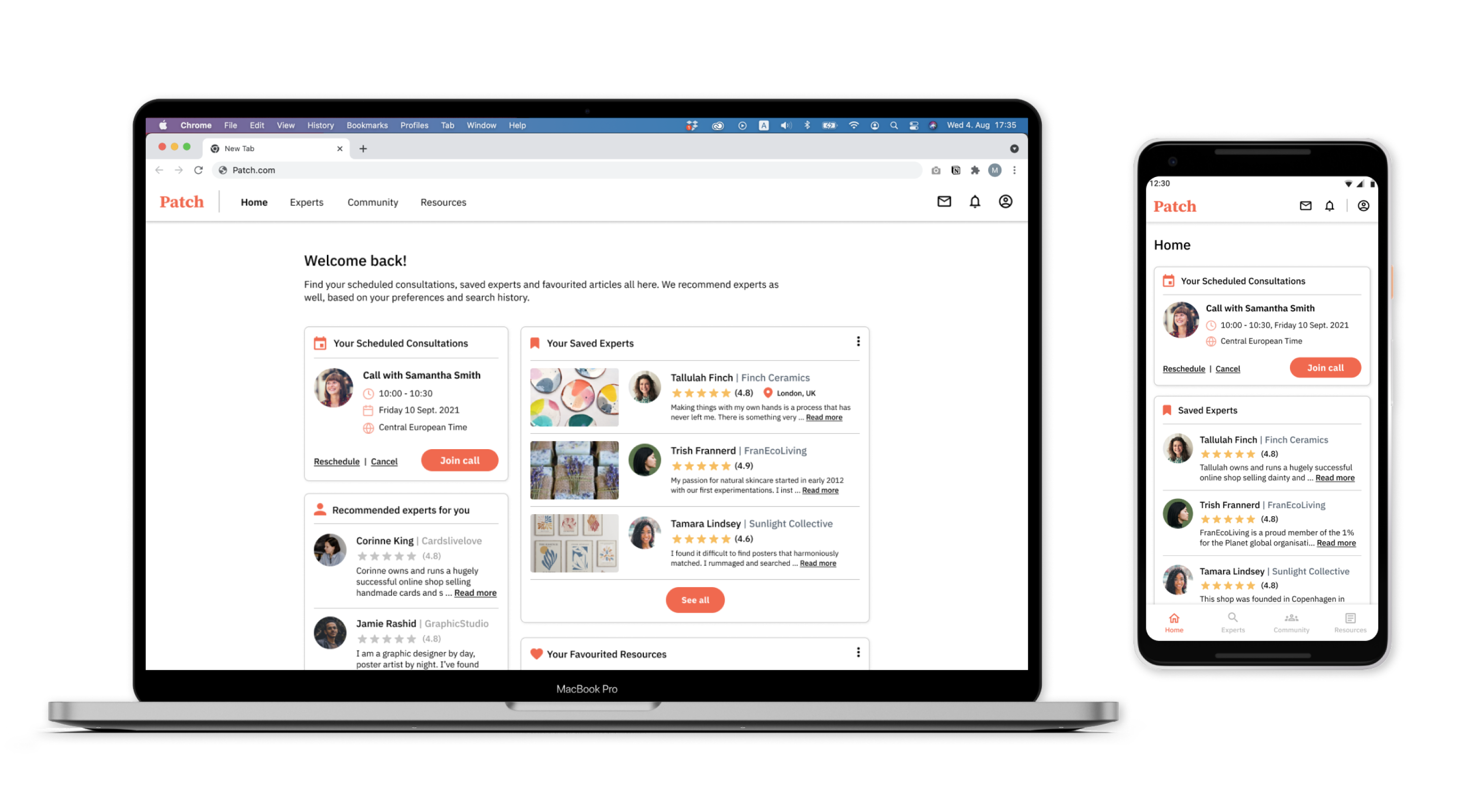
Changing grids across screen sizes to allow for a responsive app
