IFS Branding & Website
Visual Design
Visual Design
IFS is a Danish aviation tech company. At the time, the company was going through a lot of change; in the team, in management, in strategy and in market positioning. This naturally came with a need to update and modernise their inward/outward appearance. Seeing all the changes they were going through, I proposed a full rebrand to truly reflect what IFS was becoming and to freshen up their image.
The aviation industry is still catching up with the digital revolution that has swept the world in the last few decades. The challenge was to infuse the IFS brand image with start-up energy and a strong tech culture, yet still be approachable to EFB managers who might be sceptical of adopting new tech solutions. In order to stand out and attract the best tech talents to create the best customisable EFB, an updated visual style was in order.
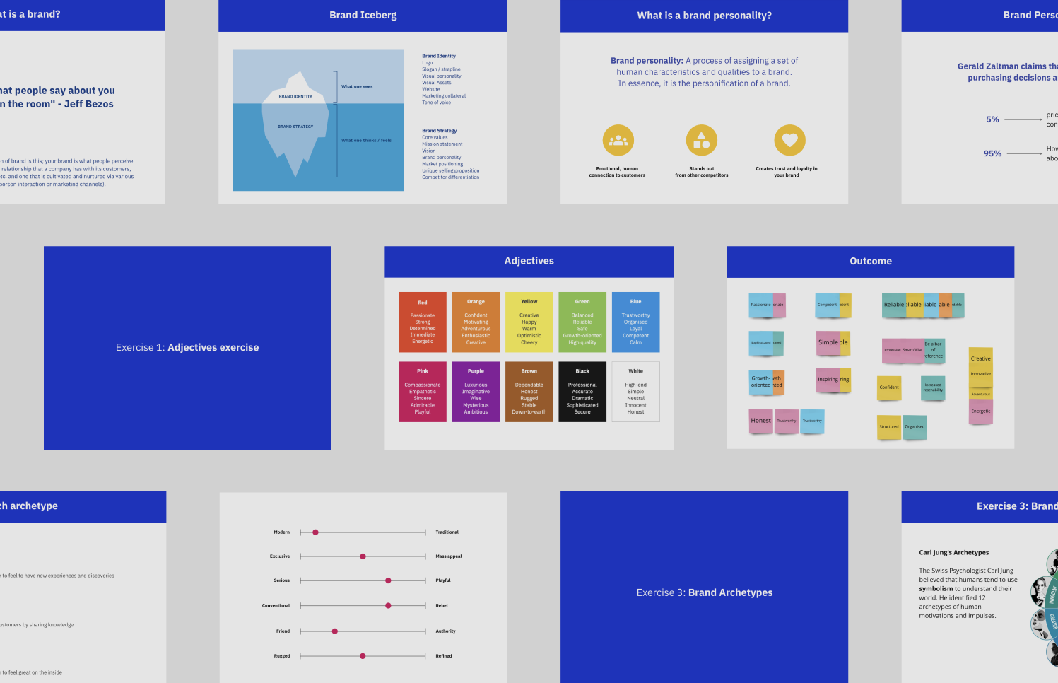
To kick-off the rebranding for IFS, I prepared and facilitated a number of collaborative brand building workshops with both the management team and key people from various teams. It gave considerable insight into the current perception of the company and what employees envisioned for the future of IFS.
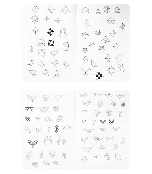
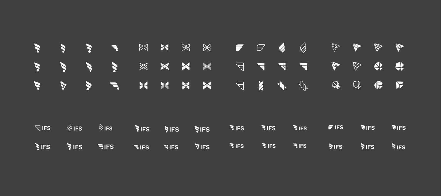
After several workshops and much discussion about the visual direction of the brand, I took to my sketchbook and started exploring several directions for the logomark. I explored following three directions:
Origami - I thought it may be an interesting visual play as the company’s mission was to eliminate paper from flight operations
Wing motif - when you think of avaition, it’s a no-brainer; however I wanted to put a modern twist on the classic symbol
Steampunk - retrofuturism is a fascinating genre and I used some reference images as starting points
Following the decision of the final logo, it was then time to explore colour options. As a general visual direction, a young, start-up feel was favoured which led to the exploration of a combination of bright (almost neon) colours as an accent colour. The aviation industry is still catching up with the digital revolution that has swept the world in the last few decades. The challenge was to infuse the IFS brand image with start-up energy and a strong tech culture.
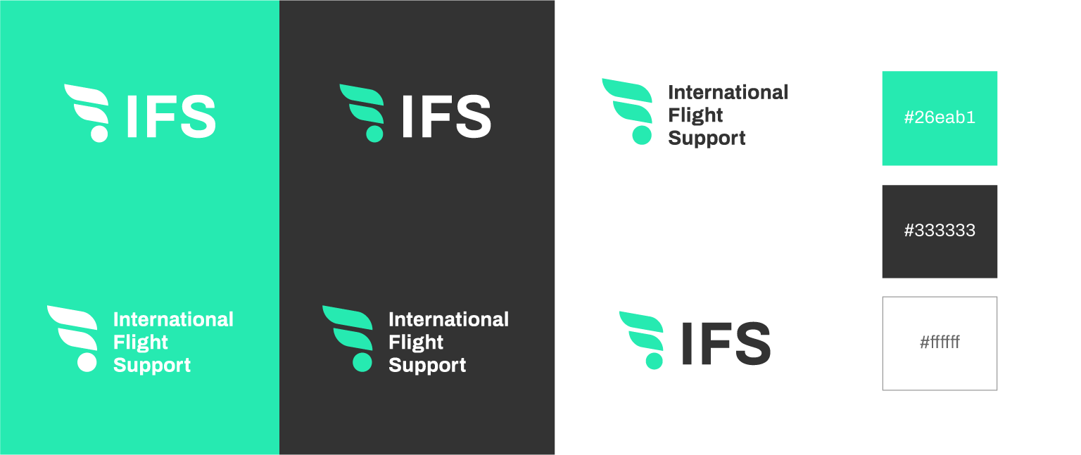
IFS is an abbreviation of International Flight Support which meant that a range of lock-ups was needed for various requirements. Using a grid, I created 3 more lock-ups that could be used depending on the needs of the company.
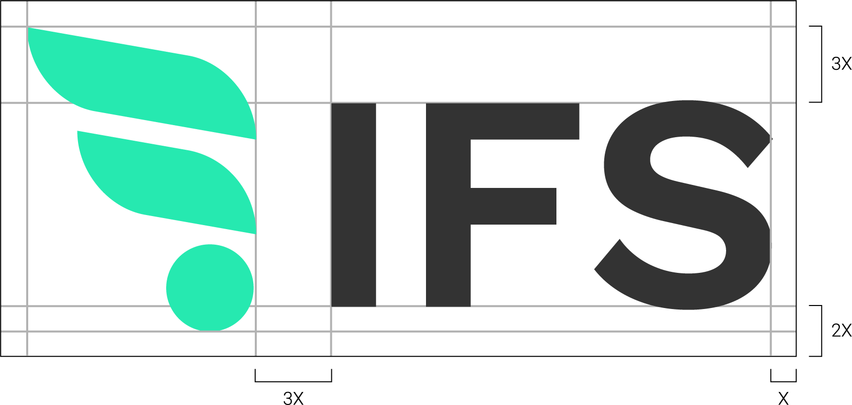

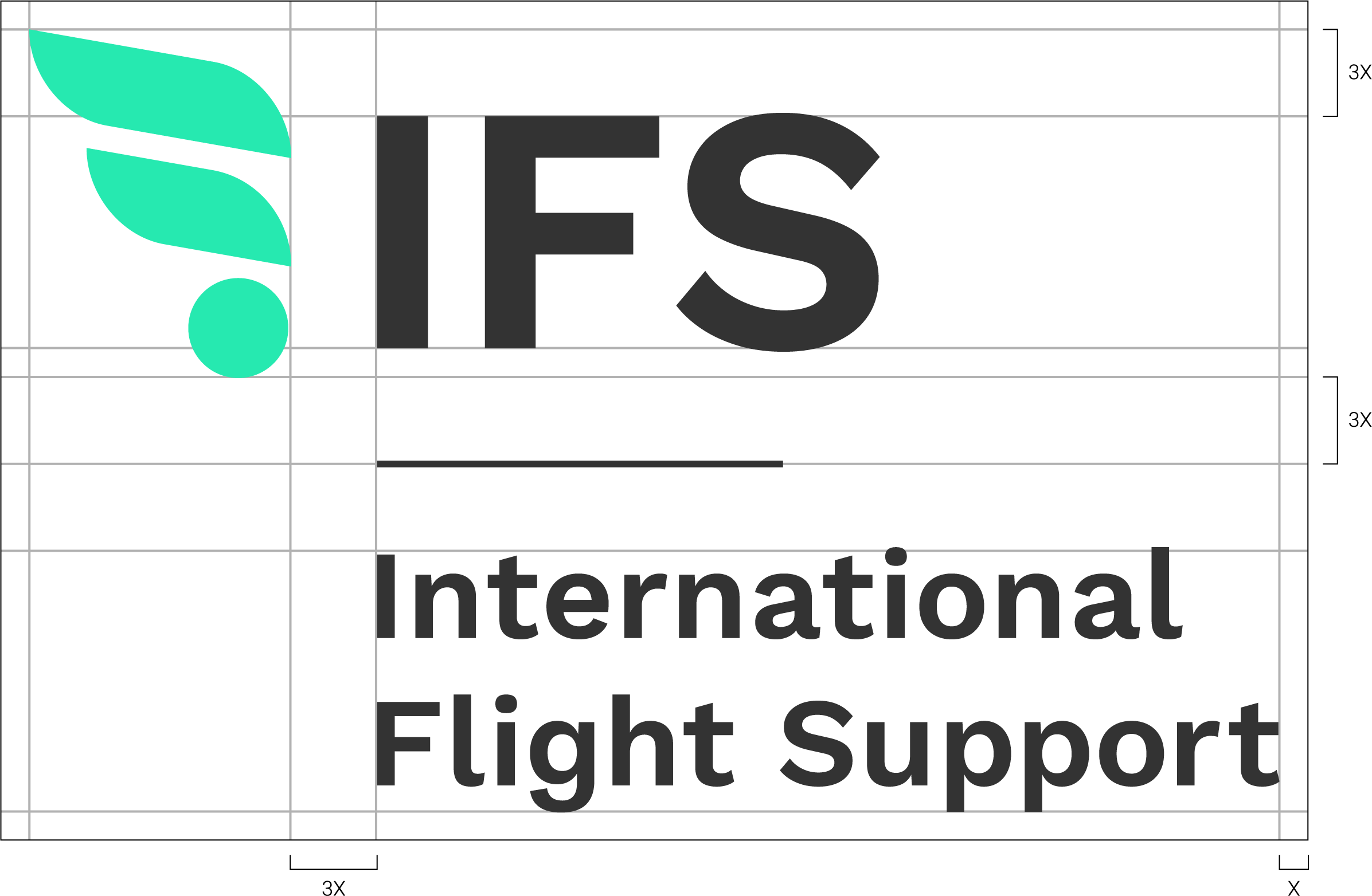

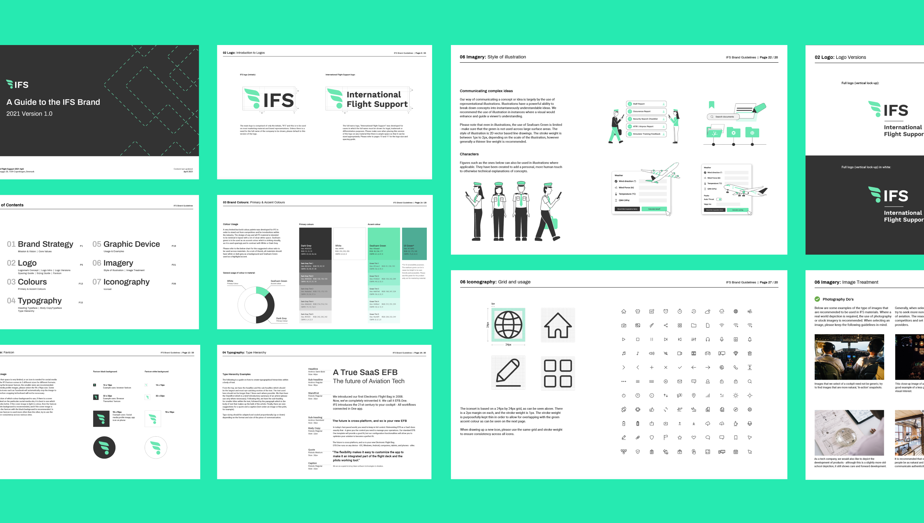
An extensive 30+ page set of brand guidelines was created that detailed strategy, logo, colours, typography, graphic devices, imagery and iconography. This was created for consistency and unity across all IFS materials in order to create and maintain a strong visual brand that would be remembered by many.
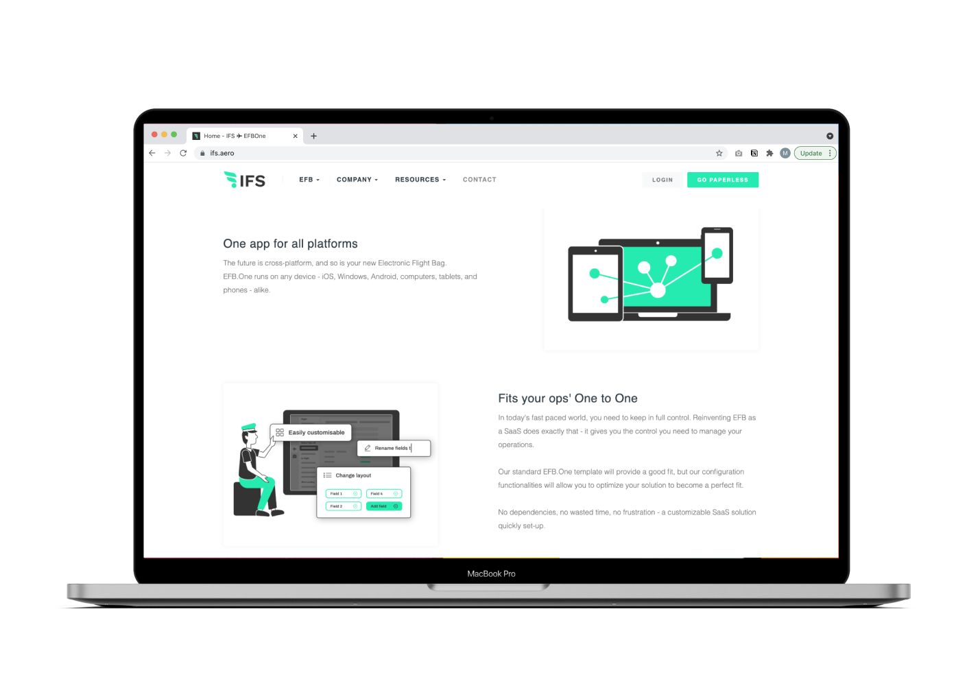
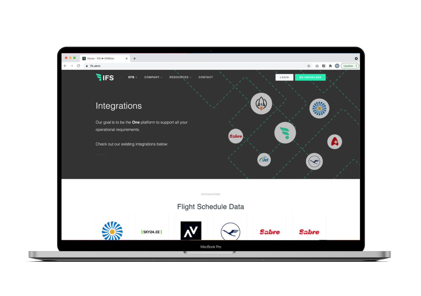
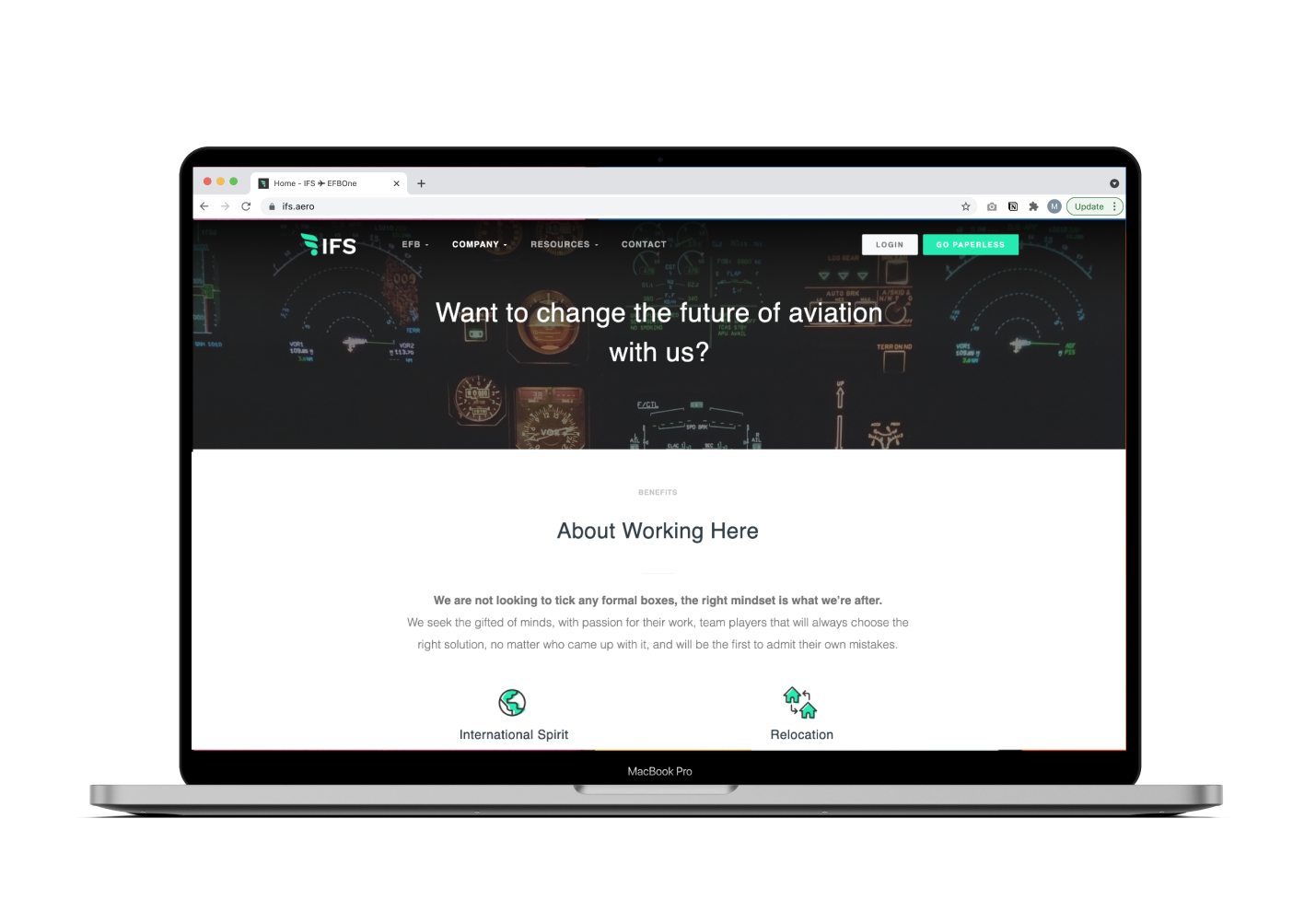
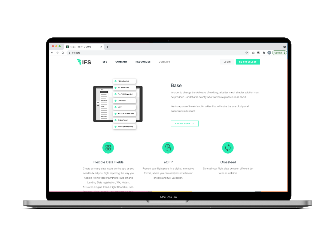
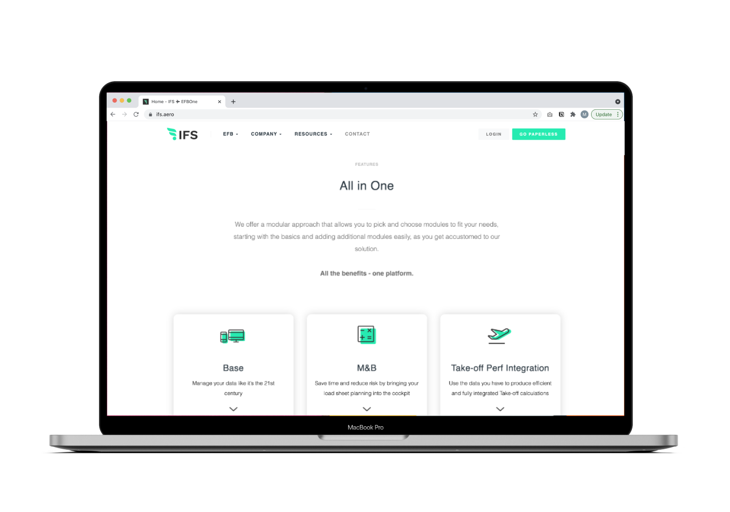
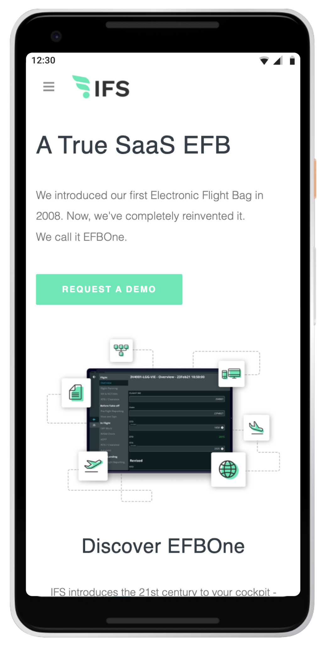
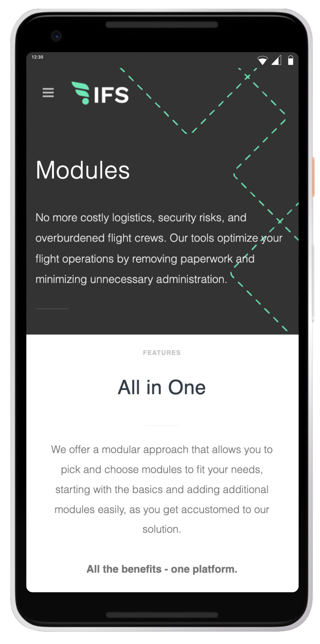
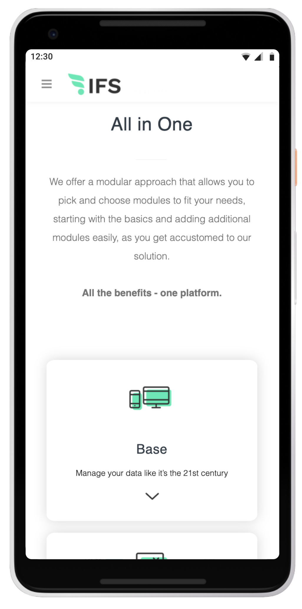
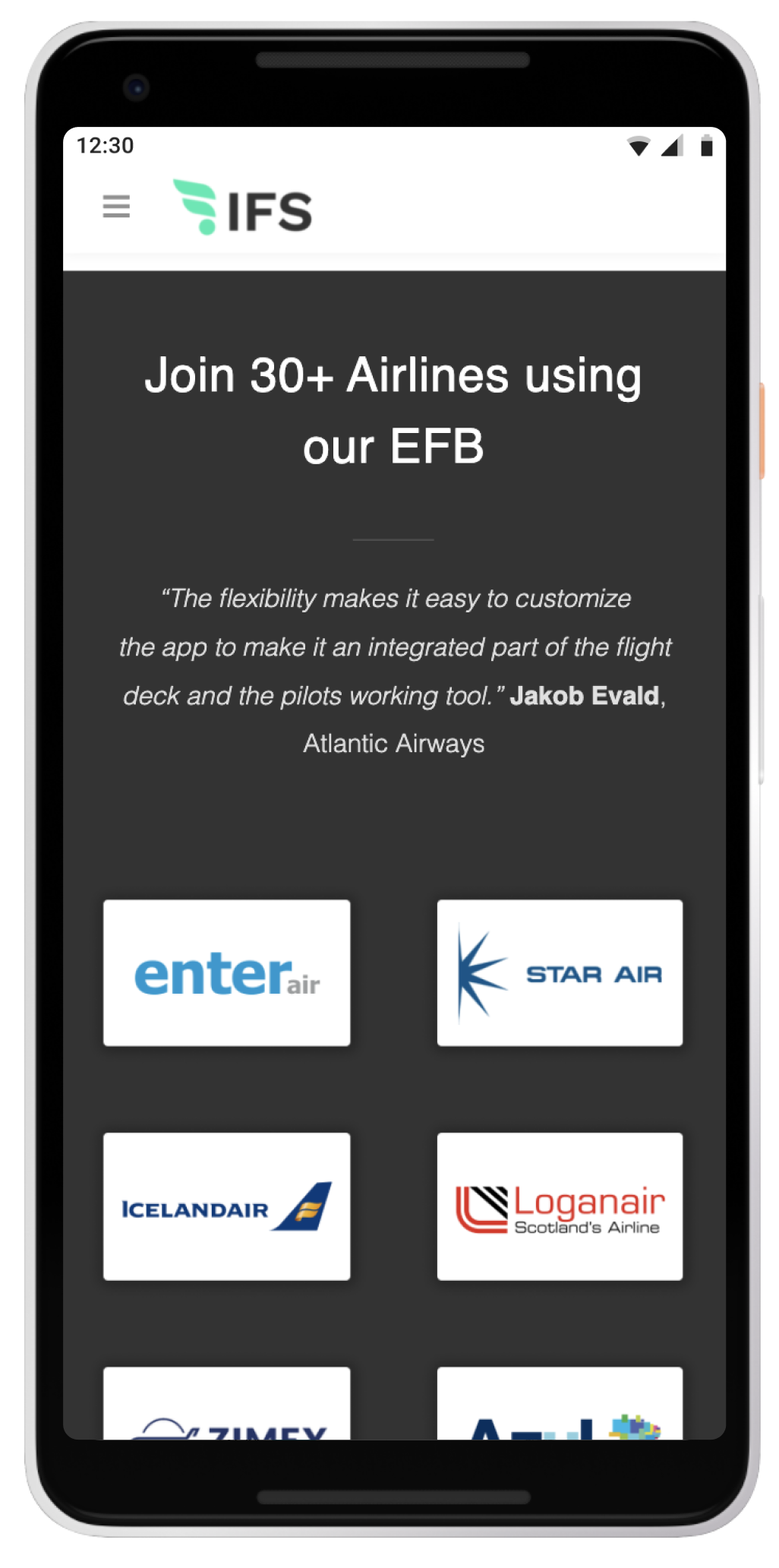
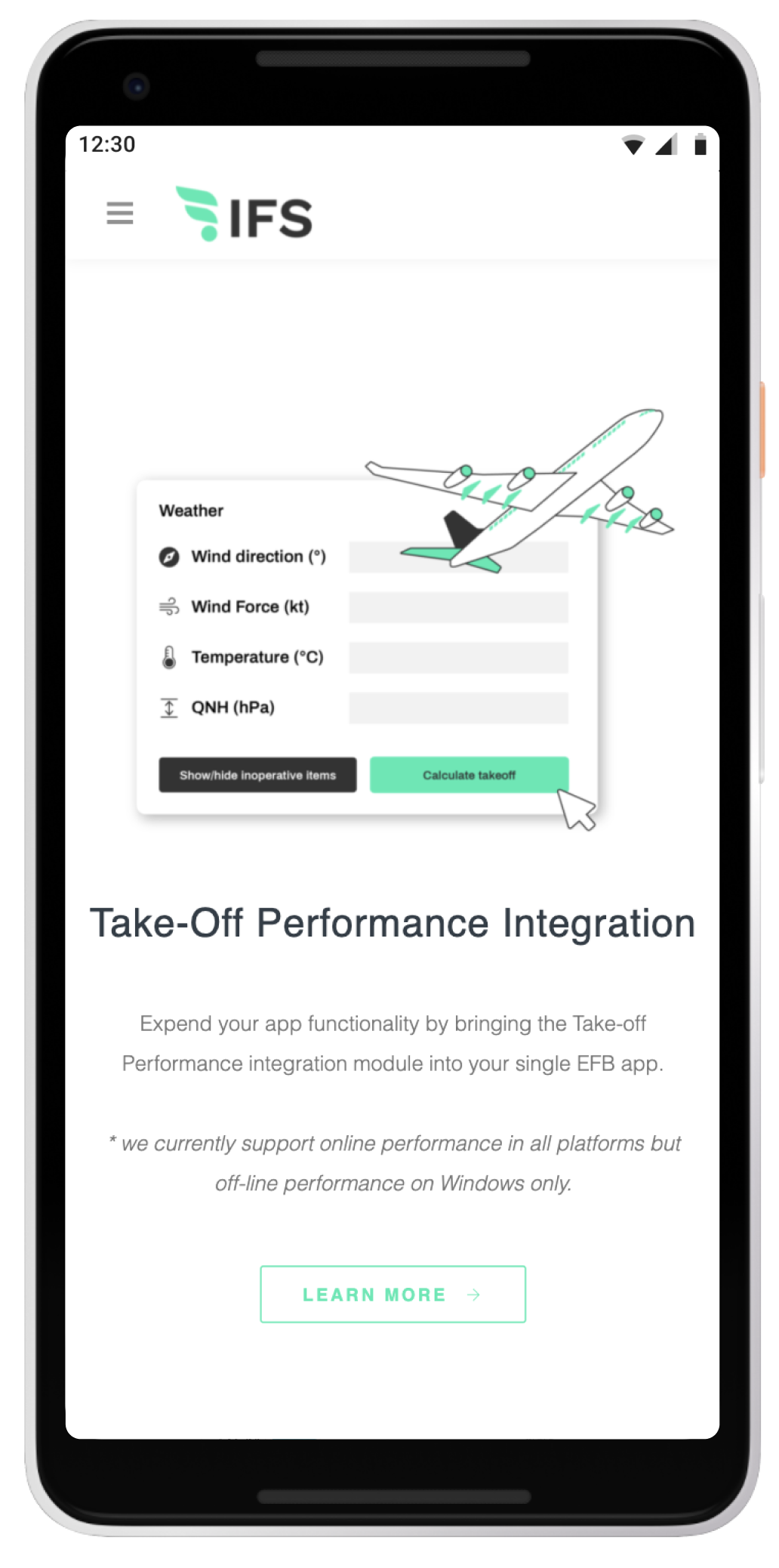
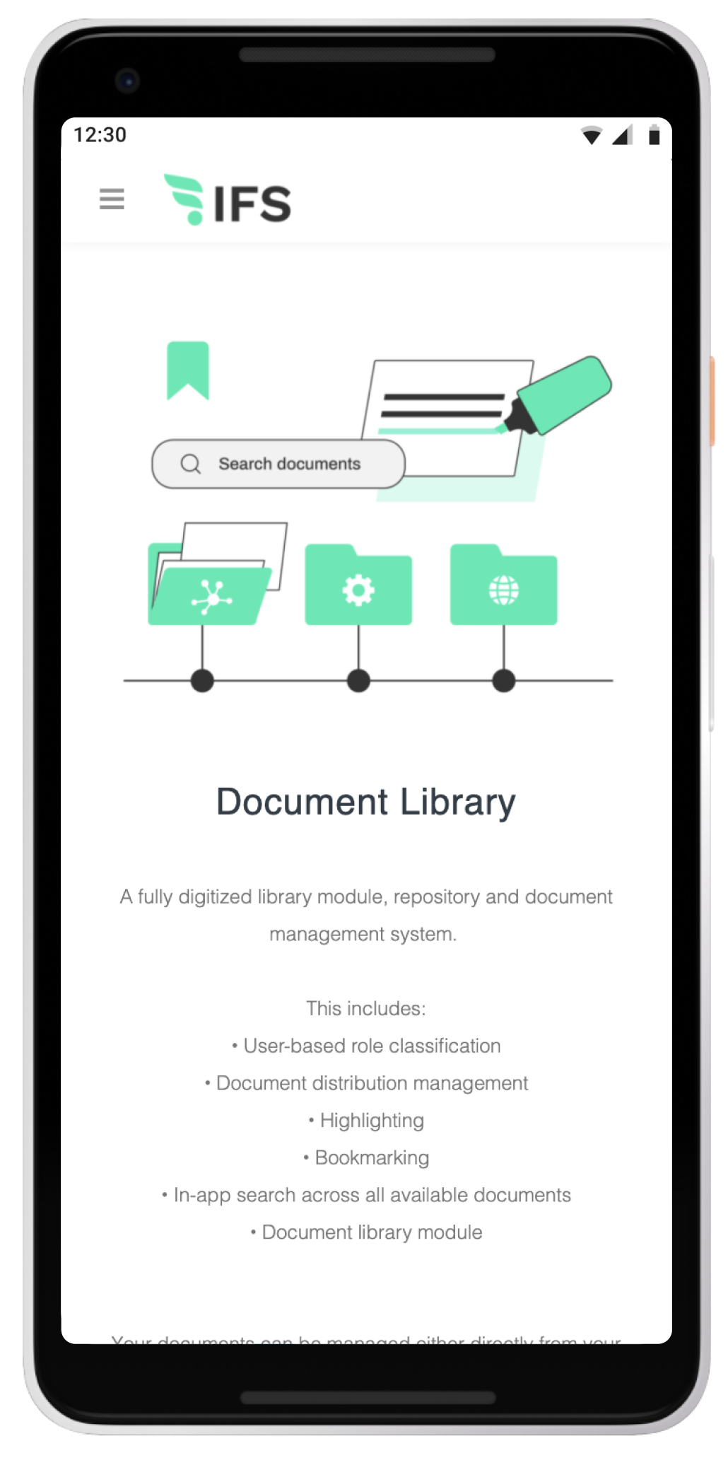
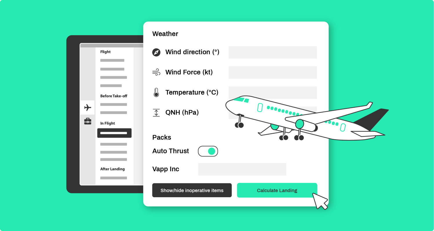
A brand new website was created following the new IFS brand guidelines. Due to the nature of SaaSproducts and their complexities, illustrations and simple visualisations were a must for their website. The result is a website that shows rather than tells, and has a clear hierarchy and structure that is easy to navigate.
